Rekindle
A supportive social space for rebuilding your emotional wellbeing one step at a time.

Brief
Many people recover from toxic relationships struggle to rebuild their social confidence. Existing social media platforms can feel unsafe, lack support especially during the vulnerable healing periods they need.
Affinity Map
Fear of judgement
Need for anonymity
Seeking validation
Isolation feelings
Trust issues
Want community
Need resources
Gradual healing
Safe space
First Diamond - Problem Space
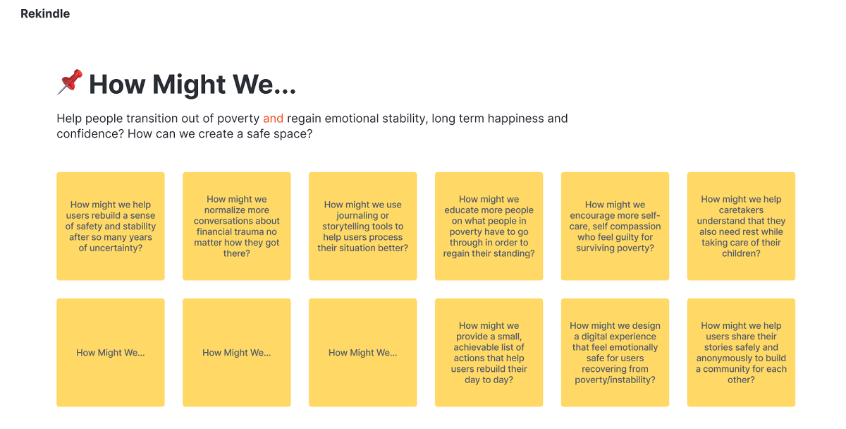
How might we help users rebuild a sense of safety and stability after so many years of uncertainty?
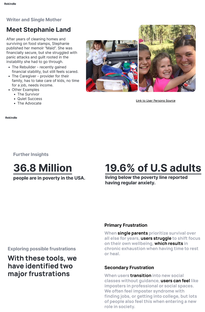
Research on Target Audience and Personas
Competitive Analysis
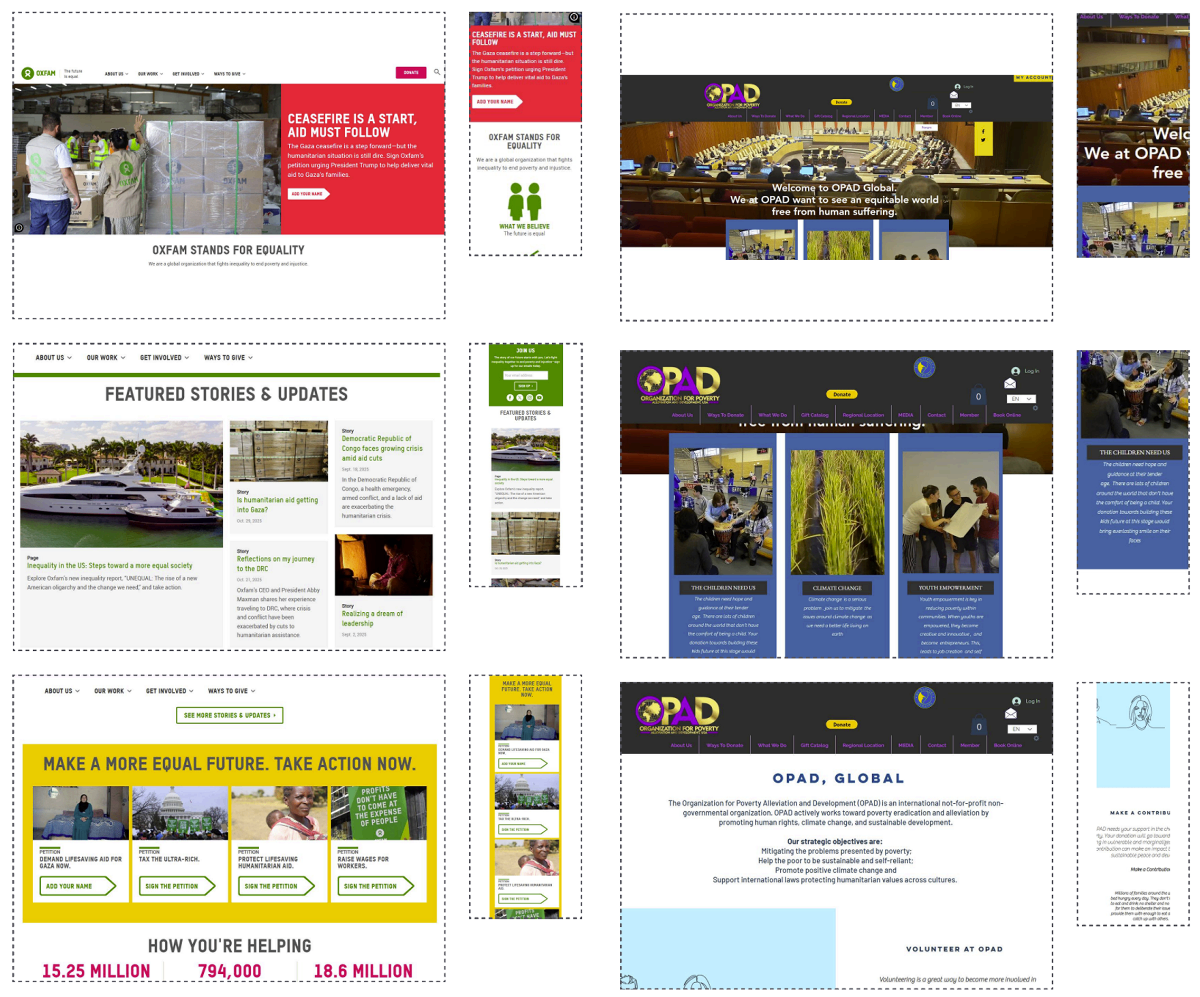
Oxfam America
Mission Statement:
We are a global organization that fights inequality to end poverty and injustice.
Target market:
Socially conscious individuals aged 25–60, professionals who care about global inequality, poverty reduction
Strengths:
- Strong global brand: recognized worldwide, builds instant trust
- Clear messaging: "The future is equal" captures its mission and emotional appeal
- Transparent Impact Reporting: Has clear stats like 15.25 million people helped to show their credibility
Weaknesses:
- Overloaded Homepage: There is so many call to actions its hard to navigate easily
- US-Centric: Its messaging is primarily only US statistics but the goal is to help everyone globally
- Limited Interactive features: It relies on a lot of static text instead of dynamic visuals
OPAD (Organization for poverty alleviation)
Mission Statement:
We at OPAD want to see an equitable world free from human suffering.
Target market:
Globally minded donors aged 30–65 interested in poverty alleviation especially in Africa/developing nations
Strengths:
- Clear humanitarian focus
- Emphasizes child welfare, youth empowerment and climate change
- Community driven approach
- References UN's consultative status
Weaknesses:
- Cluttered design
- Mobile not optimized
- Unclear navigation
- Too many colors and overlays
Second Diamond - Solution Space
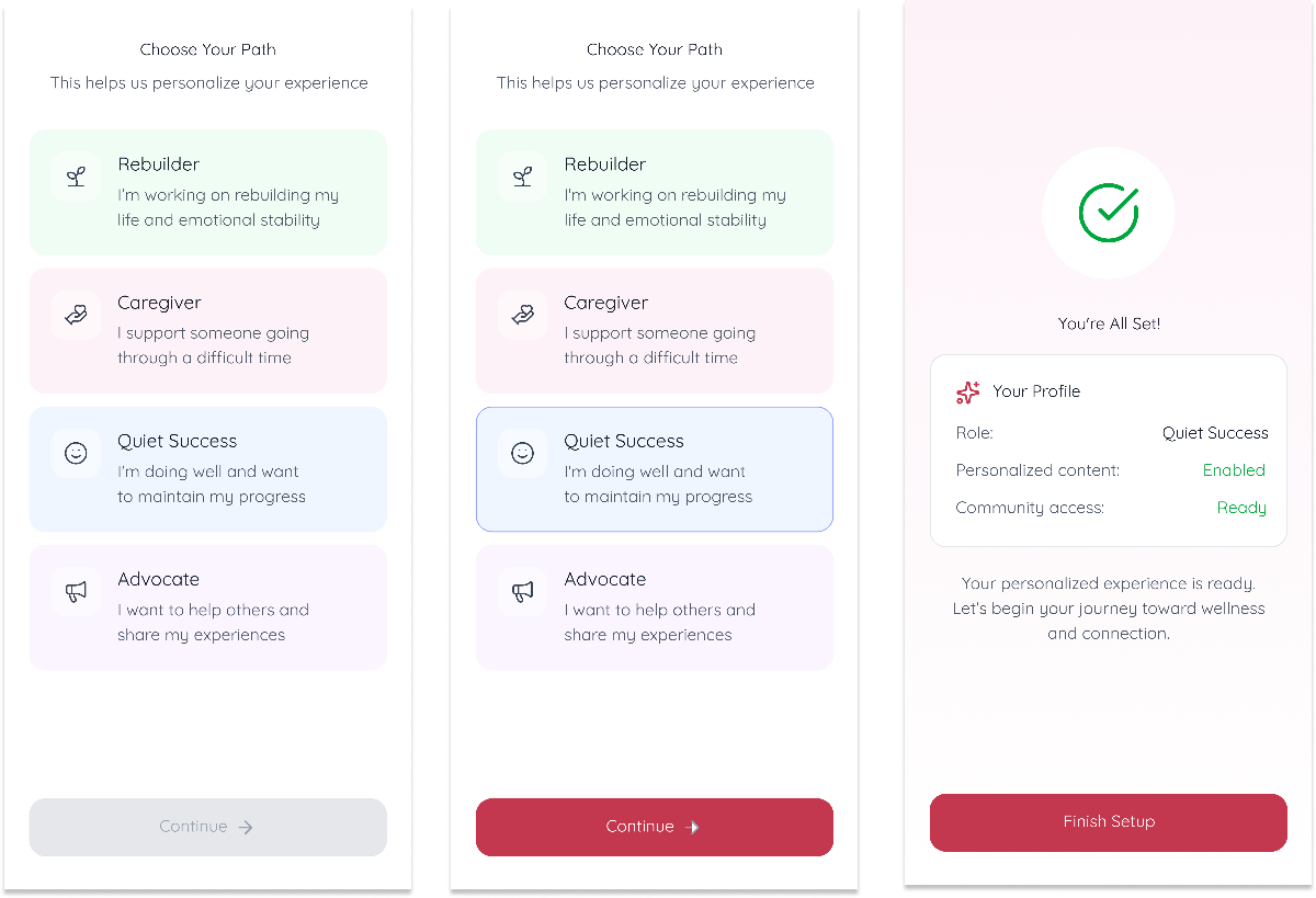
With our research insights finalized, we moved into designing a solution that balances safety with connection, professional support and a peer community that has the ability to keep the user anonymized and free for them to learn/post.
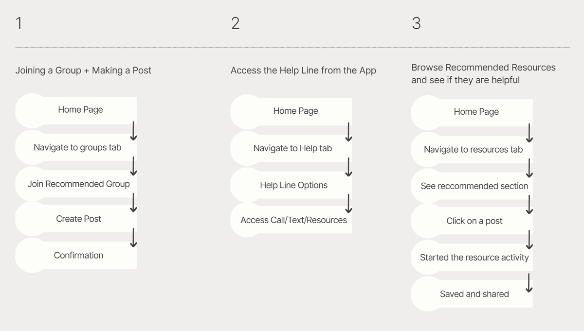
Our key user flow was allowing our users to join a community group and start posting/engaging.
Key Features to Prototype
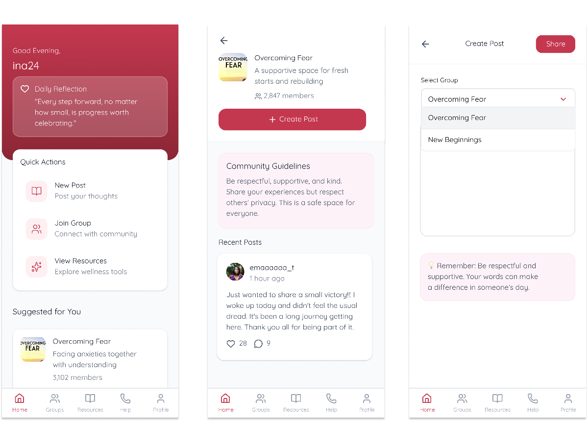
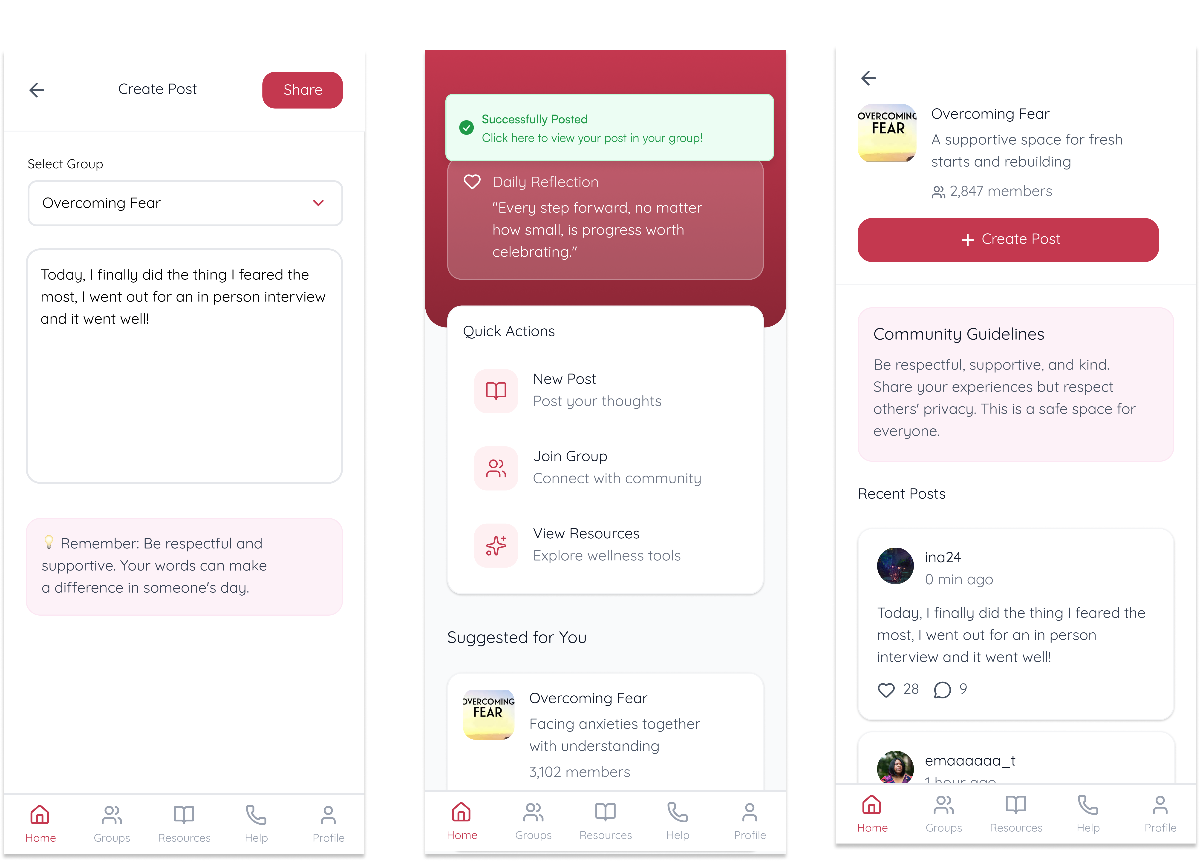
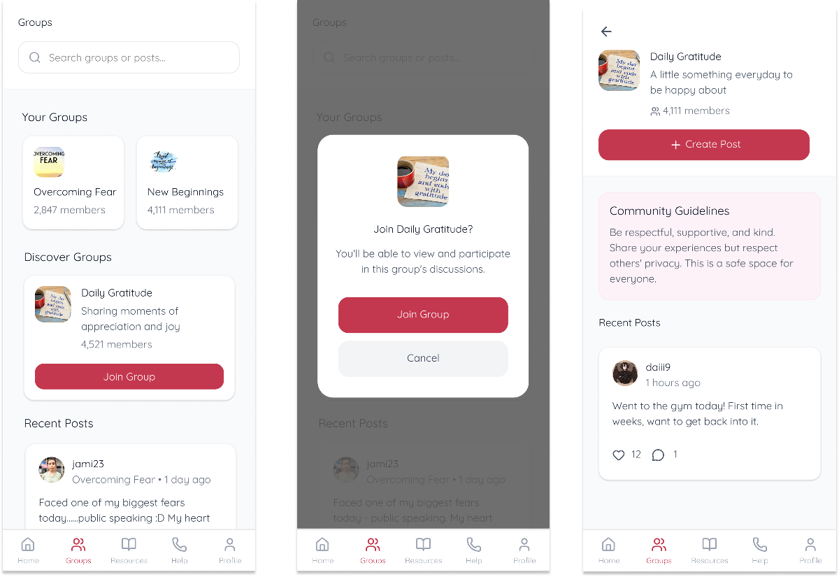
Join a Group and Post
Users will be able to browse recommended posts based on what groups they have joined, what posts they have interacted with, and share their own stories anonymously. The interface wants to encourage connection with the pressure of.
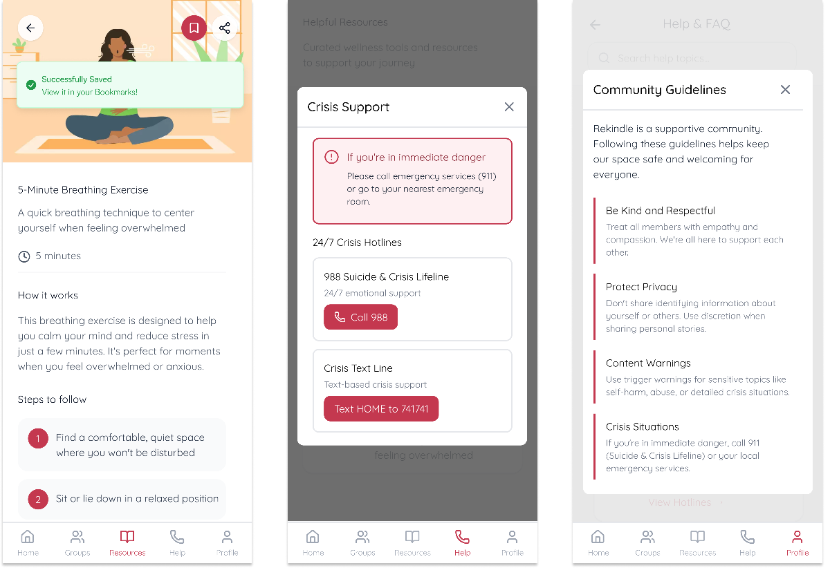
Access Help Line
There will always be immediate access to crisis support which is available 24/7 from any screen. The help line is a necessary feature so that there is a quick connection to trained professionals at anytime during difficult moments.
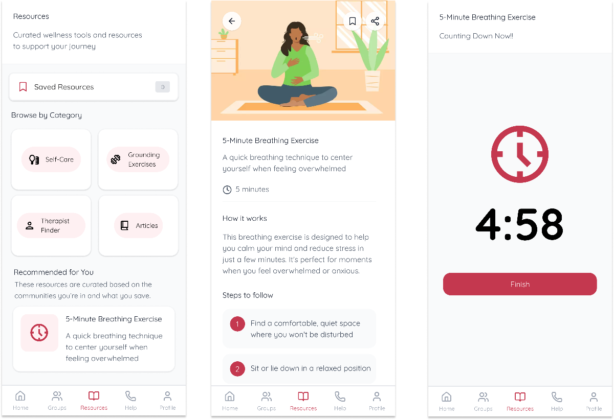
Browse Recommended Resources
There will be curated articles, videos, or exercises that help a user get through a difficult challenge they are currently going through based on what information the app has collected so they can find exactly what they need when they need it.
Initial Paper Prototype
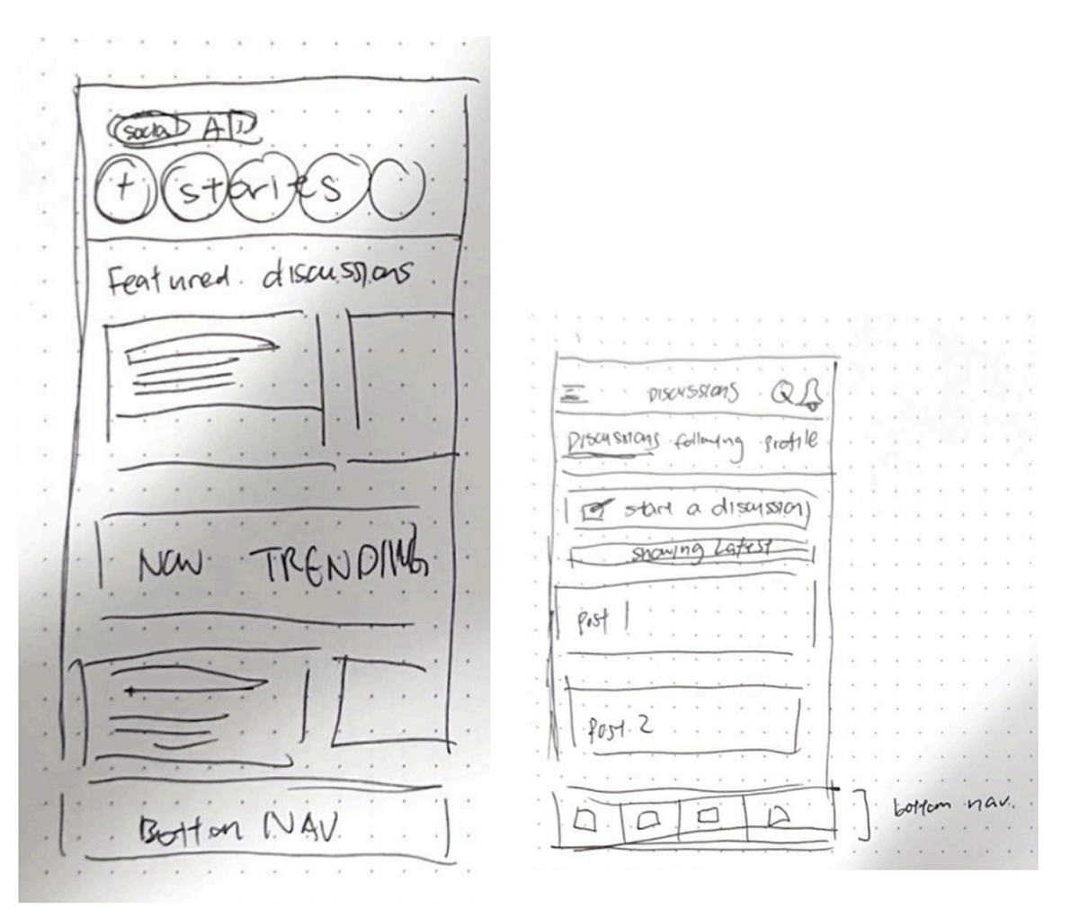
I wanted to explore what a social feed can start to look like without making it so overwhelming like the modern ones we have today.
A finding in visibility was noticing the help button and finding out what types of colors we should go with.
Design System
01. Color Scheme
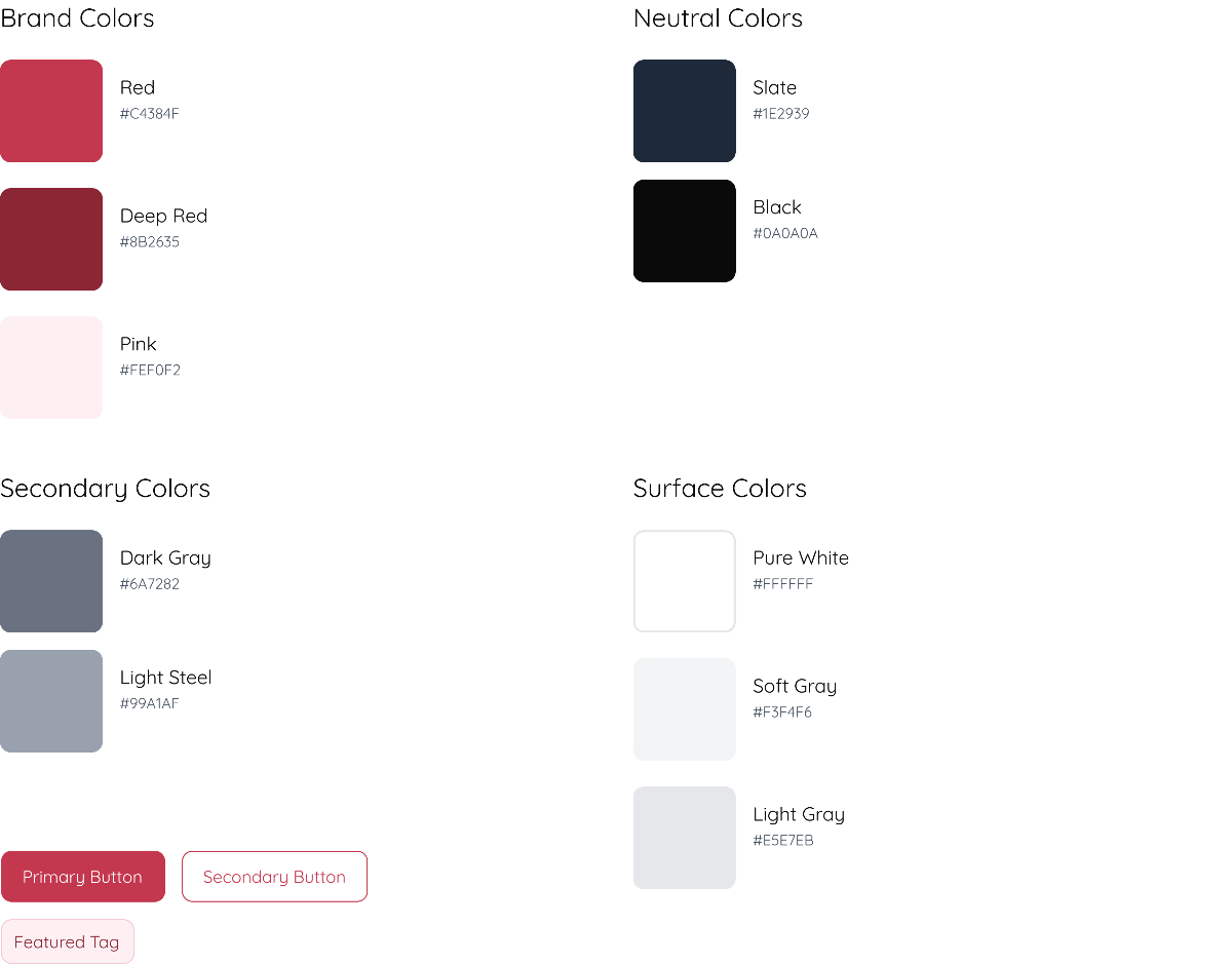
Rekindle gives the imagery of flames or an ability to reignite something that has been through a lot before so I wanted to use a reddish tone as one of the main colors, but still keep it easy on the eyes. So there's only 1 core color and greys.
02. Typography
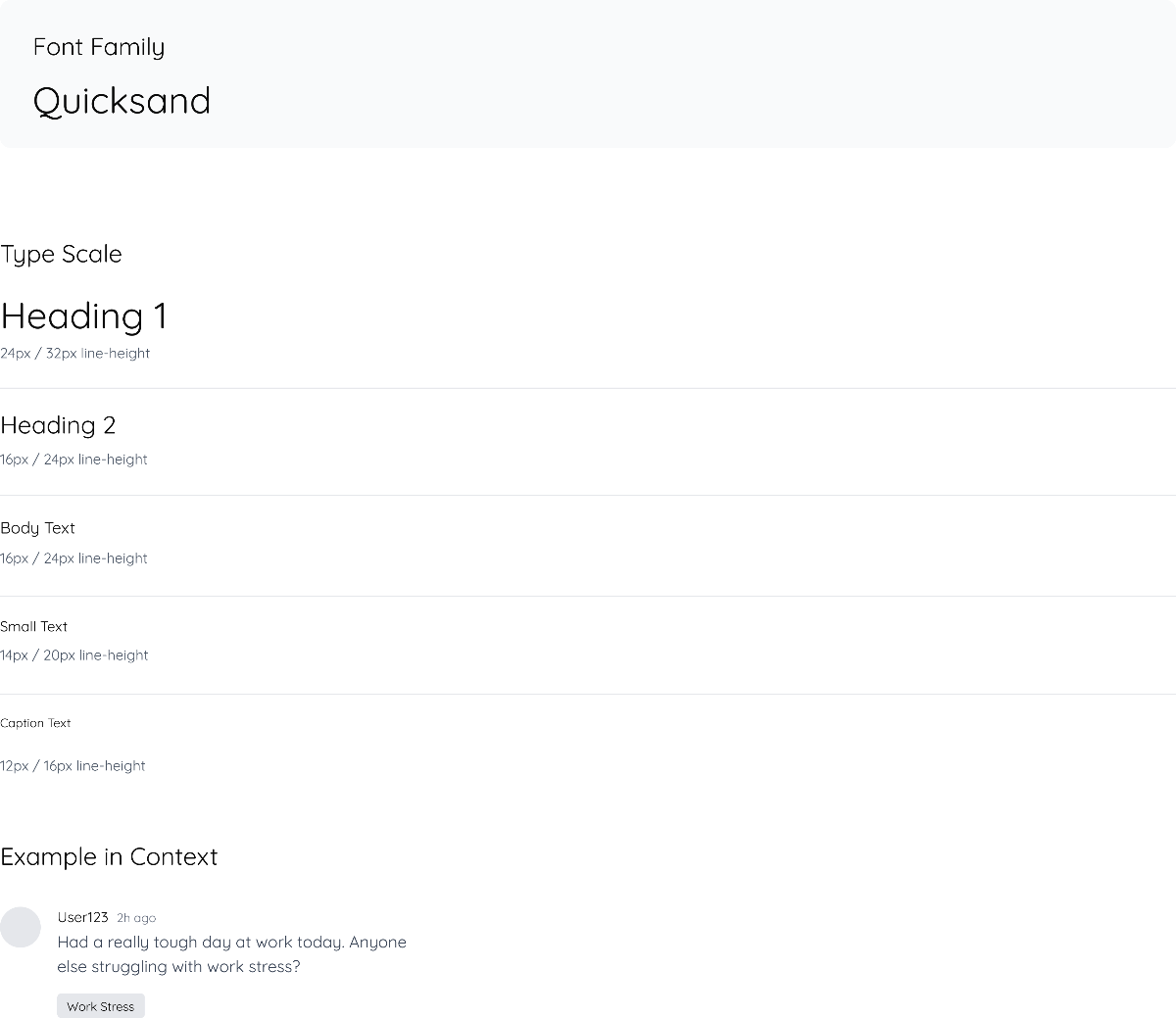
I used Quicksand because of its rounded edges. It feels very soft and communicative towards people who need support. I went with 5 basic sizes that I believe can be useful for all cases.
03. Iconography
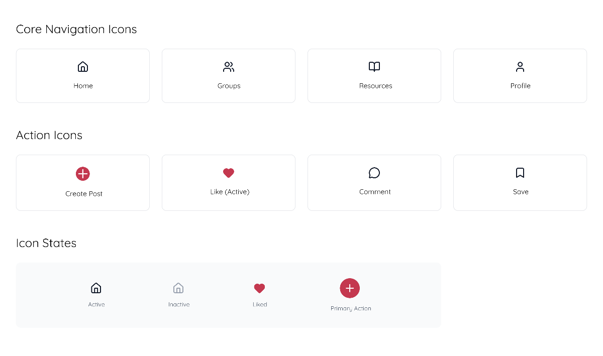
I chose these main 4 icons because this would be the main bottom navigation bar. I believe I will add more as time goes on, but for now, these icons serve as the main functions of what we offer on the app.
04. Imagery
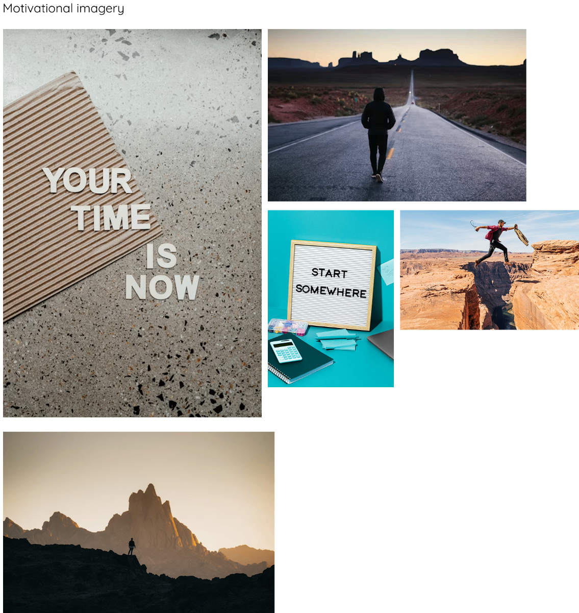
The goal in this imagery is to support emotional wellbeing. The goal is to make resource browsing deeply integrated with community interaction rather than a passive reading experience. Rekindle can cater and recommended you resources based on what you post and the groups you interact with.
05. Initial Components
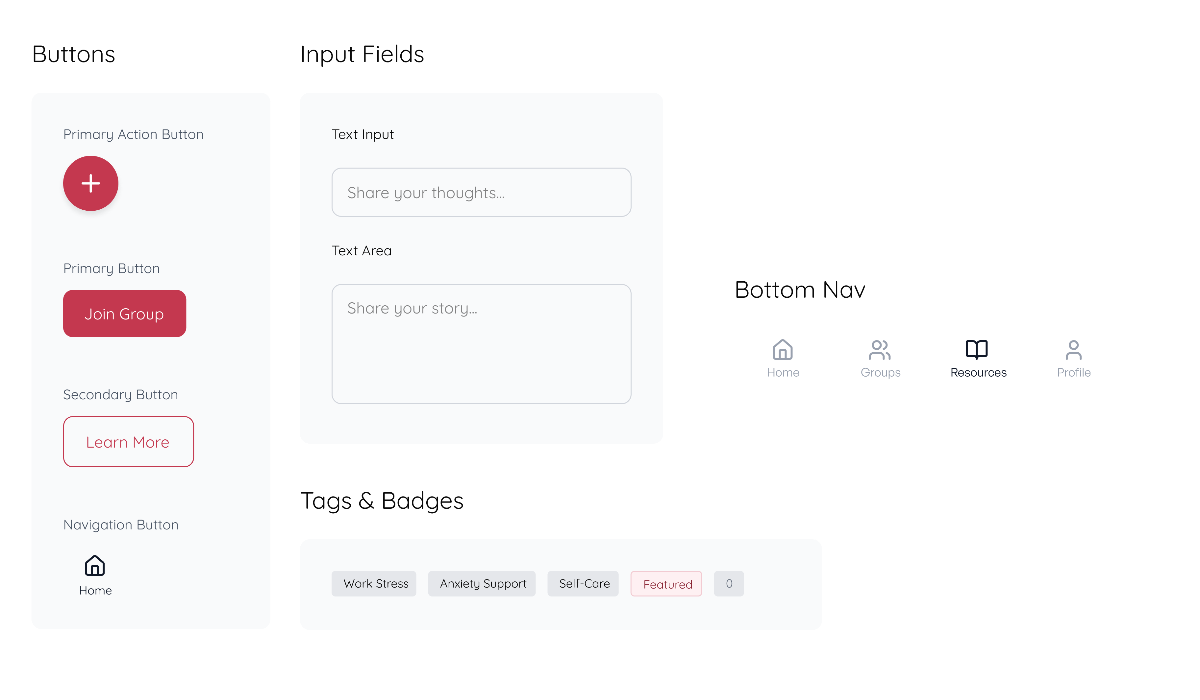
Here are some initial component designs. The buttons will be useful for mobile nav especially the + can be a floating icon at the bottom right. The text input fields will also be relevant for us as we will have people posting on their groups.
Usability Testing
1) Users felt the Home page had too many actions and overlapping functions with the nav bar.
- •Remove or simplify the "Quick Actions" module
- •Prioritize one primary CTA on the home screen
- •Let the secondary CTA's live in navigation menus or others only
Expected Impact: Reduces a lot of the cognitive load and aligns the home page more cleanly & clearly.
2) Post categorization isn't clear
- •Add more category icon tags like "advice", "venting", etc.
Expected Impact: Helps users scan content faster and skip ones they don't want to see.
3) Resource Recommendation Logic Not Explained
- •Add a 1-2 sentence description on why these specific resources were catered towards them, maybe a tooltip on why they are seeing this one.
Expected Impact: Builds more trust and transparency/personalization with the user.
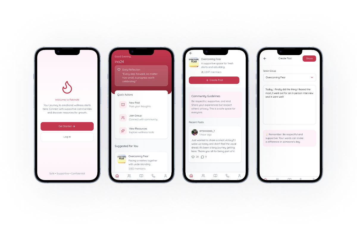
Final UI Screens
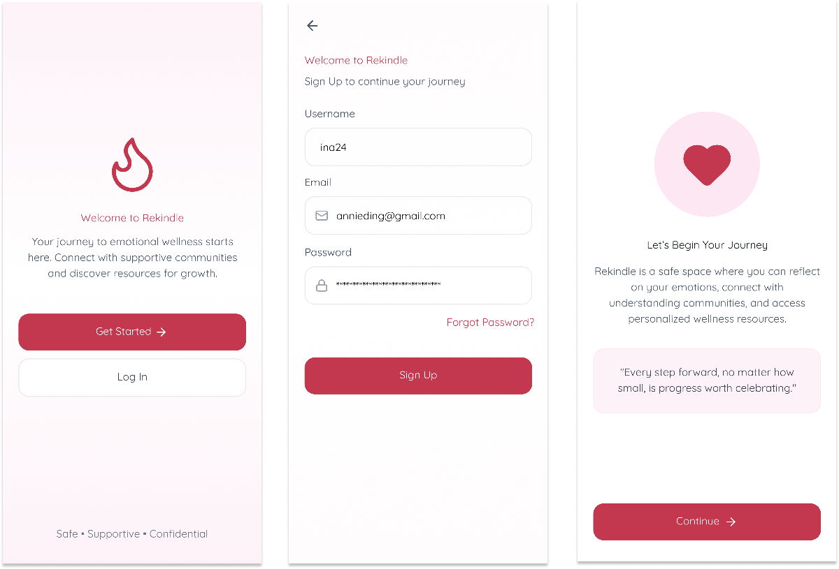
Onboarding
Task 1 - Creating a new post in a group
Task 2 - Joining a recommended group
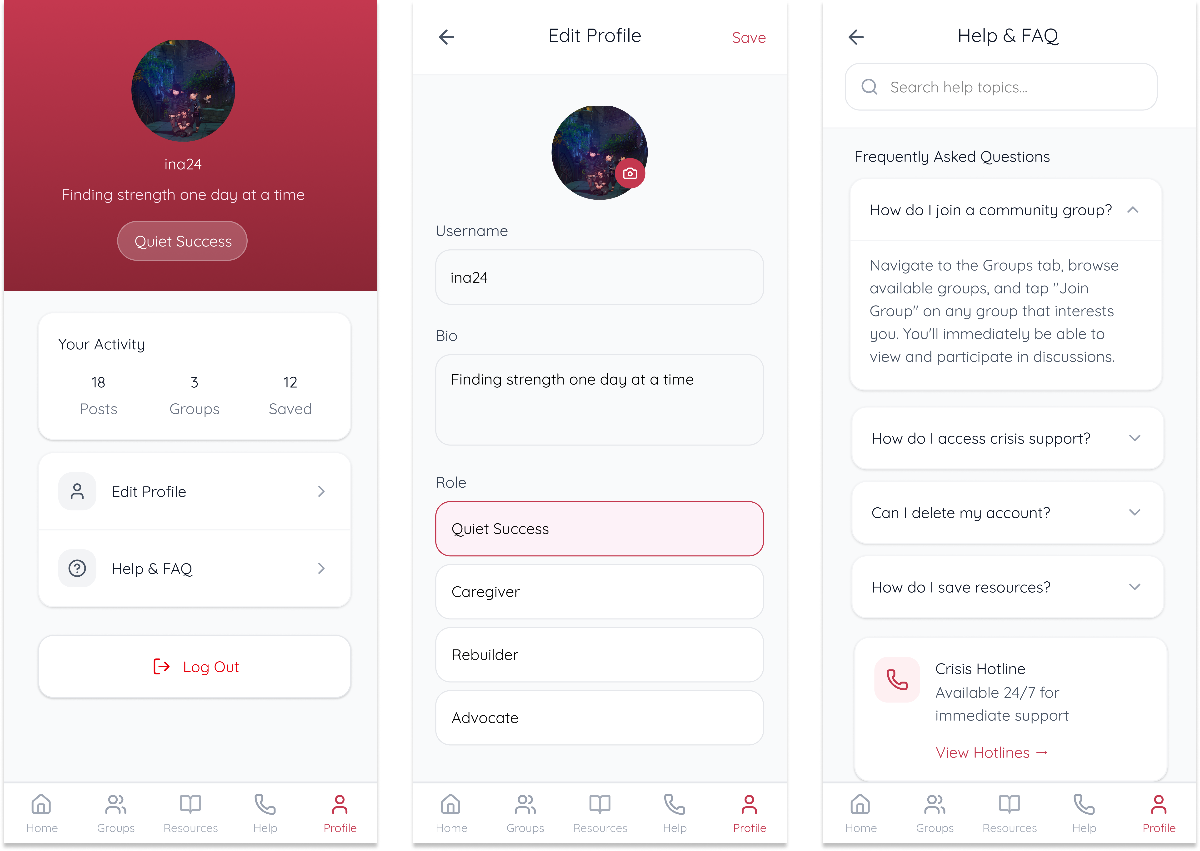
Task 3 - Visiting the resources page, help line, and profile
Reflection and Next Steps
What makes my product feasible, viable, and desirable?
Feasibility:
The core features are achievable with what is currently existing in mobile development frameworks, specifically with the catered recommendations based on previously engaged with content. Crisis support integration require partnerships but are well-established services.
Viability:
Mental wellness is a growing market especially within the Gen-Z space. Revenue could come from premium features, therapy partnerships, and different institutional licensing. There could be b2b possibilities for support organization/personal custom groups.
Desirability:
User testing showed that the color scheme and concept had strong emotional connection. The gap in the market is clear especially when looking at competitors. Users expressed willingness and would recommend the app. A lot of users really enjoyed the possibility of having personally catered content.
What did I learn?
Designing for vulnerable users is difficult. It requires a lot more sensitivity and balance compared to creating something within SaaS. A lot of building of trust is required.
User testing is also a lot more helpful than I realized especially with assumptions that come with mental health and social media in our current society.
Finally, visual design is not about aesthetics, the color scheme and every decision is made with intent and feedback.
How would I make this project real?
I would try to attempt to build the back-end of the catering/recommendations of the groups and get at least 5 people to try using it. Once I have validated that the 5 people enjoy the app, I would reach out to volunteer groups or crisis organizations. I would keep trying to market myself to them until we get a partnership. Along the way, we should continue to iterate on the idea and take feedback.
I would build in phases but keep things fast. The most important factor would be sales and marketing and getting users to truly like it enough to recommend the product.