Brand Identity2025

Raremarq Brand Identity

Raremarq is a social marketplace designed to connect collectors, artists, and sellers in a seamless buying and selling experience. It offers a curated space for discovering original art, rare collectibles, and limited-edition pieces while fostering a community-driven ecosystem.

Unlike traditional e-commerce platforms, Raremarq integrates social engagement, auctions, and live interactions, making it a unique destination for enthusiasts. We aim to provide one of one experiences.
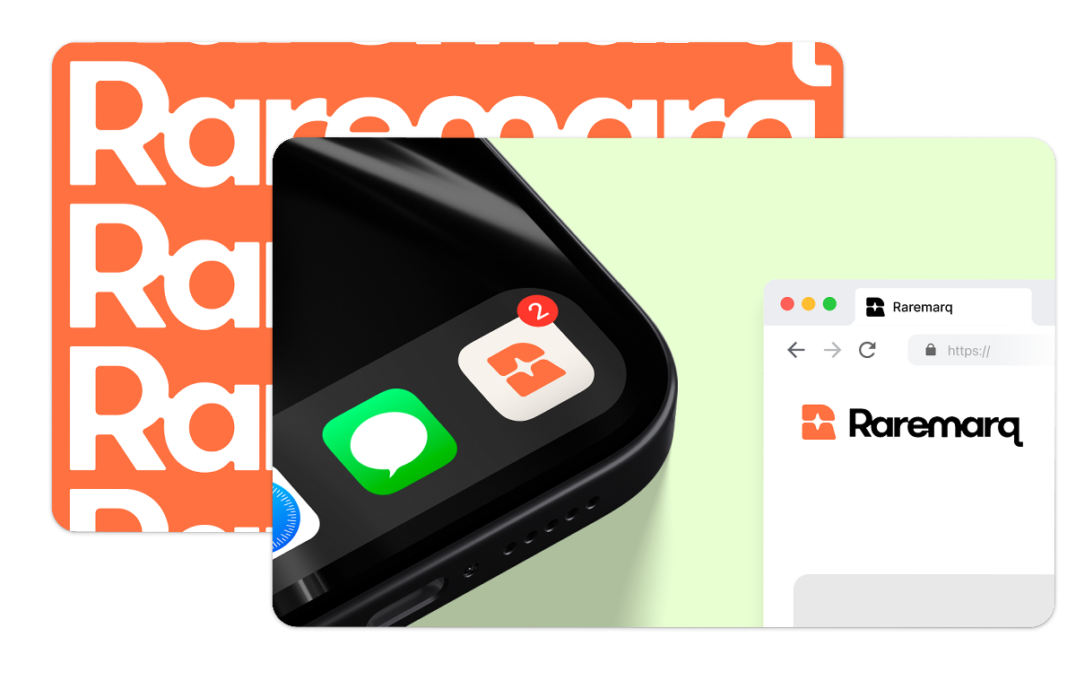
Raremarq Brand Identity Hero

My Role

Founding UX Designer

Timeline

Jan 14 – Apr 7, 2025

Tools

Figma

Team

CT

Christopher Tung

Founder

AD

Annie Ding

Founding UX Designer

S

Scott

Studio Designer @ Lunour

MB

Matt Battaglia

Graphic Designer

JS

Jacob Singer

Co-Founder and CTO

Nerd Crawler's Original Brand Identity
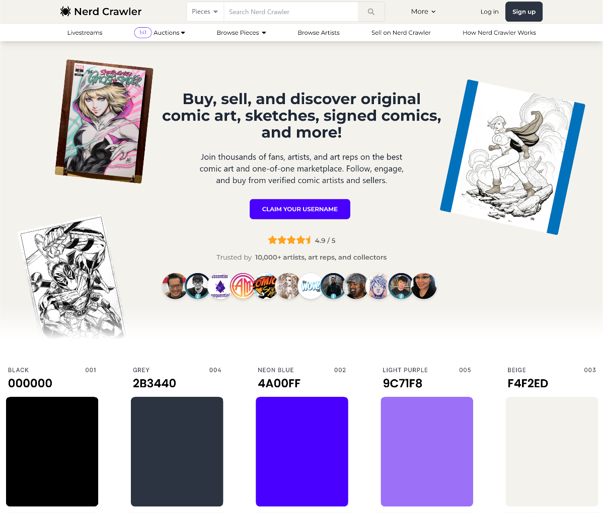
Typography

Montserrat

Design Approach

Simple, plain layout, no texture

Nerd Crawler Original Brand Identity

The Problem

The original brand lacked visual consistency and didn't reflect the warmth or premium feel we wanted to foster. My goal was to lead the rebranding of the platform to better align with our community's values and support future scalability.

“It looks simple.”

“It doesn’t really have any color”

“Everything works but, it doesn’t look aesthetically pleasing.”

“The colors are really bland.”

Users described it as “bland” and “uninspiring,” which limited brand trust and failed to convey the creative spirit of our artist-focused platform. The sparse color use and inconsistent visual hierarchy made it difficult to distinguish between content types or create a sense of brand identity.

When I first joined Raremarq, I was designing new features like livestream functionality and mobile web pages — all within an inherited design system that quickly showed its limitations. The existing brand lacked structure, consistency, and flexibility.

As our team scaled and our valuation approached $10M, a common theme emerged from investor conversations: the product looked too early-stage.

Every VC we spoke with emphasized the need for a more cohesive, premium visual identity to match the product's ambition and traction. Without a scalable design system or strong branding foundation, it became increasingly difficult to build new features that felt unified or compelling.

I became deeply involved in the rebranding process — providing design feedback to the external studio shaping the new brand direction, then leading the full rollout across our platform. My work focused on translating a new visual identity into a flexible, scalable product experience that aligned with both investor expectations and our creative community's values.

Mood Board Exploration

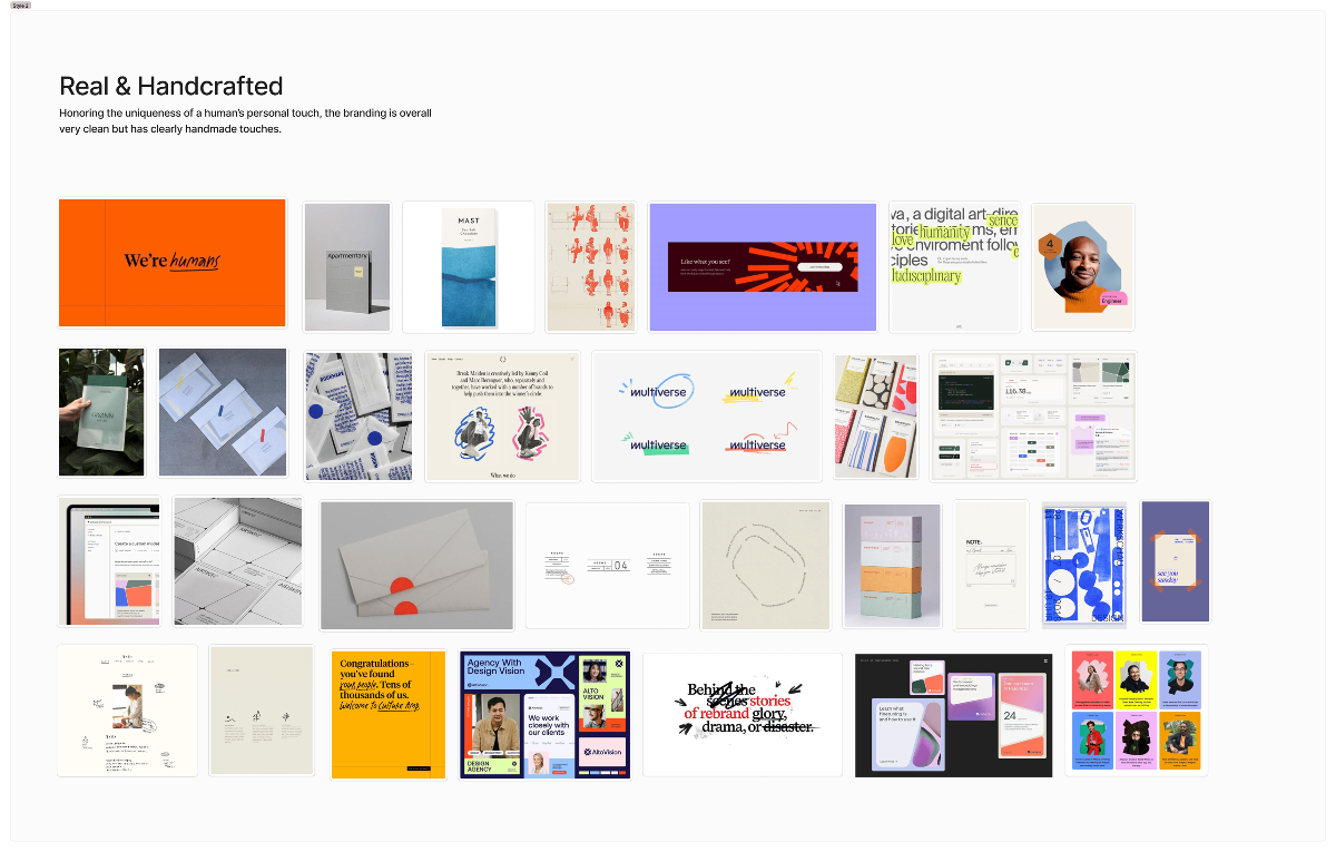
We started by crafting three types of mood boards focusing on community, artistic value, and premium.
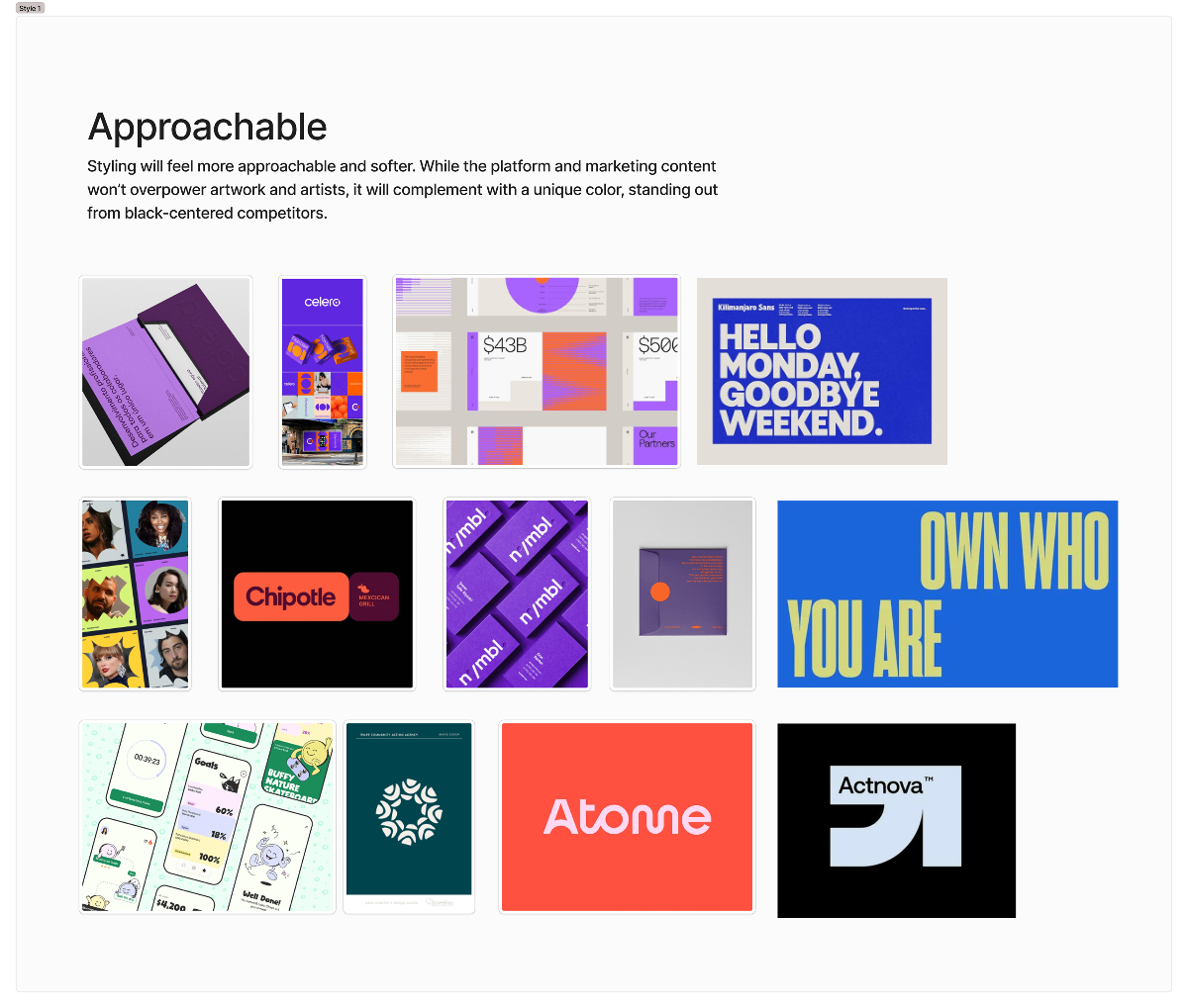
Mood Board #1 - Approachable styling concept

Concept #1 Observations

Strengths

  • The simple, bold, and casual tone allows for a more conversational design language that can develop over time.
  • A clean “neubrutalist” style can be really eyecatching and memorable. Just need to be careful to not over do it.
  • Works nicely when paired with a few key unique textures to make it our own. And breaks up the solid walls of color.

Concerns

  • Overly expressive illustration and characters. These elements can start to lock the brand in to a top down identity.
  • It can be super subjective on taste as the brand expands audiences over time.
  • Can get very expensive and time consuming to maintain.
Mood Board #2 - Handcrafted and real concept

Concept #2 Observations

Strengths

  • The hand written scribble style is very human and authentic, communicating warmth and personal touch.
  • Creates a sense of intimacy and approachability that could resonate with creative communities.
  • The organic, imperfect aesthetic feels genuine and could differentiate from more polished competitors.

Concerns

  • The hand written scribble style while very human, also communicates a roughness of seeing Work in Progress and the collaborative process. But not the well crafted and considered final work.
  • This is why we see this style with a lot of productivity SaaS platforms. Maybe not an evocation we want people to have.
  • Feels a little too “scrapbooky” feel for Nerd Crawler, we want a balance between more artsy but, modern multimedia.
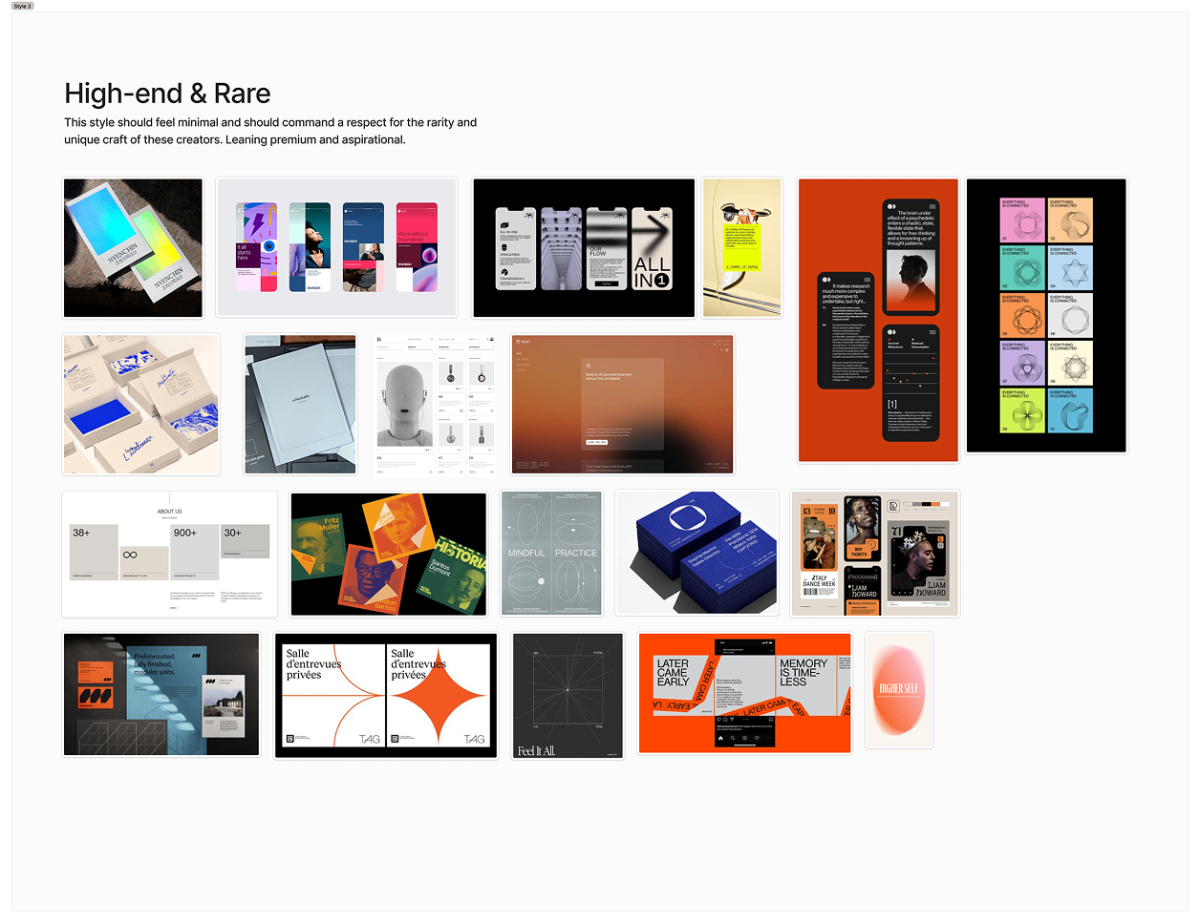
Mood Board #3 - High-end and rare concept

Concept #3 Observations

Strengths

  • Another great insight to build around. Similar in some ways to Concept 1. But much more crafted, elevated, and considered of a look and feel. High risk but high reward.
  • This approach could feel much more opinionated about what good design is. You would feel Raremarq itself, as a brand, has an expectation on the level of quality they are curating.
  • Creates a premium, gallery-like atmosphere that elevates the art and collectibles being showcased.

Concerns

  • Where concept 1's more minimal brand vibe allows the dialogue between creator and fan to be the focus, this approach might overshadow user content.
  • Could feel intimidating or exclusive to casual users or emerging artists who don't yet have “gallery-worthy” work.
  • Requires consistent high-quality execution across all touchpoints, which can be resource-intensive to maintain.

Concept Iterations

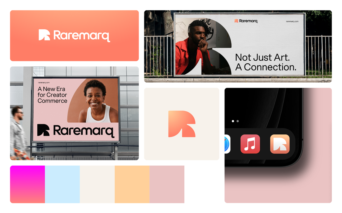
Early explorations focused on translating the new brand direction into scalable interface components and layout systems.
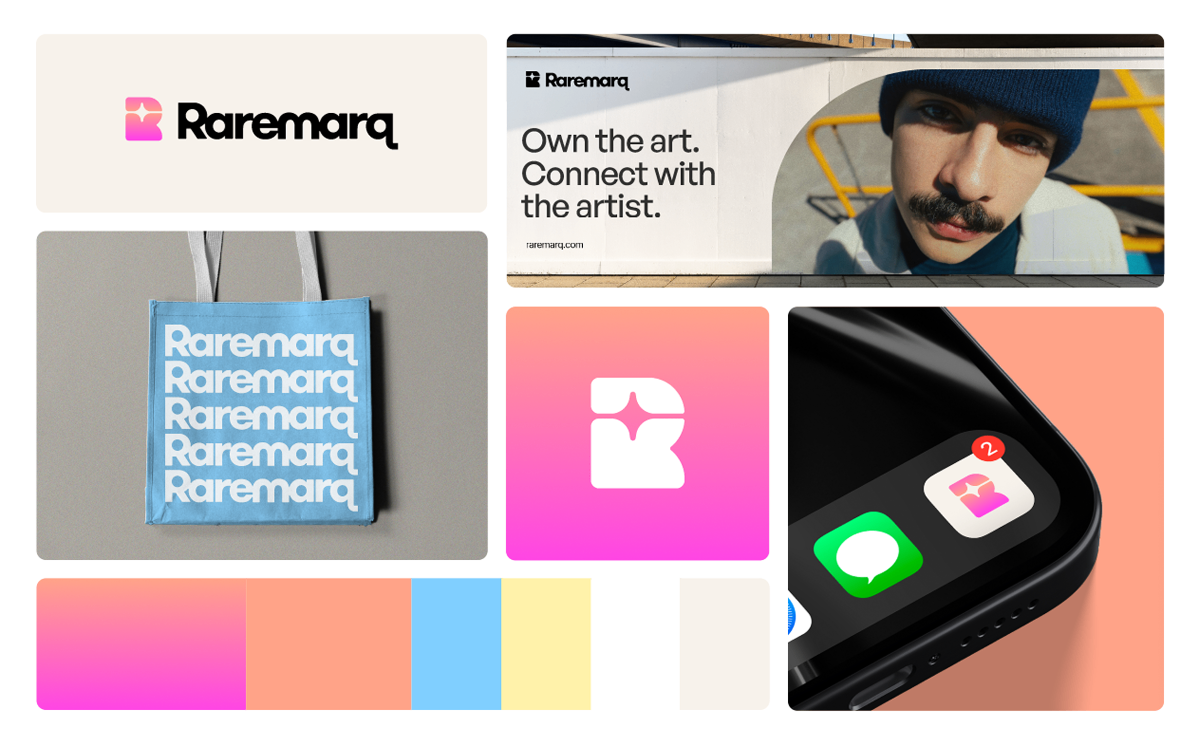
Concept Iteration 1
Concept Iteration 2
Concept Iteration 3

Branding Direction & Timeline

1

Round 1

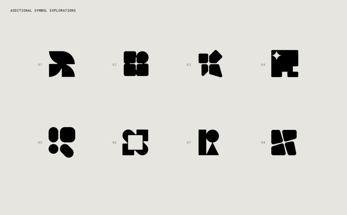
  • Called for a stronger focus on the “R” in the logo, with the spark as a secondary visual.
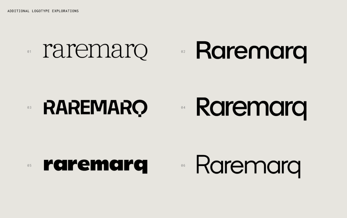
  • Suggested rounding out typography (especially the “r” and “q”) for a softer, more inviting tone.
  • Critiqued early color palettes as too harsh or technical — advised against yellow/black and overly saturated combinations.
  • Highlighted the need for a brand that felt warm, premium, and scalable — not overly abstract or techy.
Round 1 Design Iterations
2

Round 2

  • Supported ink-style, liquefied typography but pushed for thinner weights and more legible flow.
  • Preferred notched “R” designs over fully circular or abstract forms.
  • Rejected logos that resembled other shapes (e.g., arrow, spade, or “K”).
  • Encouraged testing more muted, pastel colorways to let art remain the focal point.
  • Suggested improving letter spacing and exploring a capital “Q” for clearer readability.
Round 2 Design Iterations
3

Round 3

  • Selected a refined C3 palette with a request to desaturate the background yellow slightly.
  • Highlighted dark green and bright orange as strong, community-oriented accents.
  • Finalized logo and typography choices.
  • Raised final question around the balance between visual branding (“Q”) and how the name is typed/spelled (“Raremarq”).
Round 3 Final Design Iterations

Finalized Concept

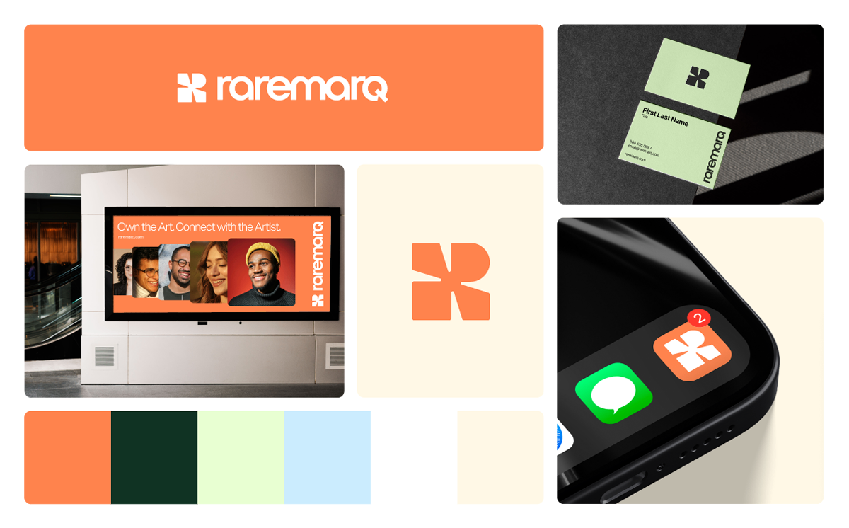
The final direction balances warmth, clarity, and scalability — built to grow with the brand and resonate with both users and investors.
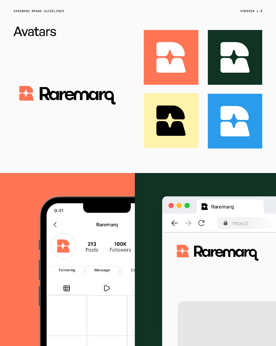
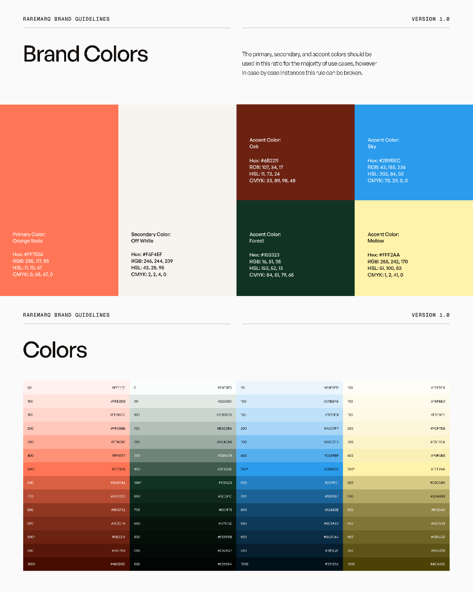
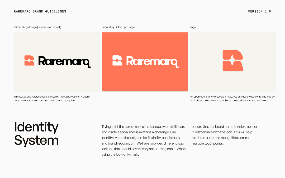
Raremarq Final Logo
Raremarq Final Color Palette
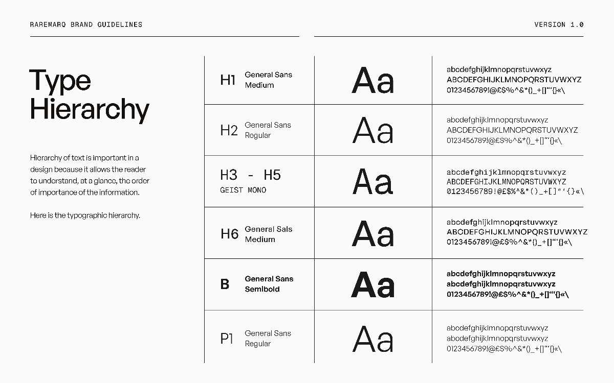
Raremarq Typography Hierarchy

New Components

Built a scalable component library to ensure consistency across pages and accelerate future development.

Buttons, Labels & Tags

A comprehensive set of button states, icon buttons, and status labels designed for consistency across the platform.
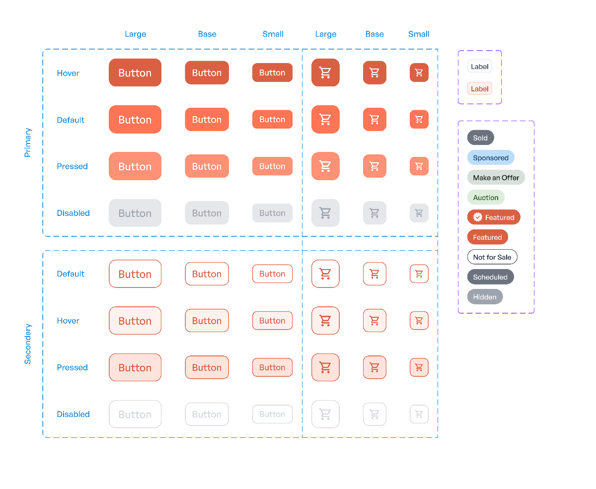
Component Set 1 - Buttons, Labels and Tags

Icon Library

A custom icon library built to support the new brand identity with consistent visual language and scalable design.
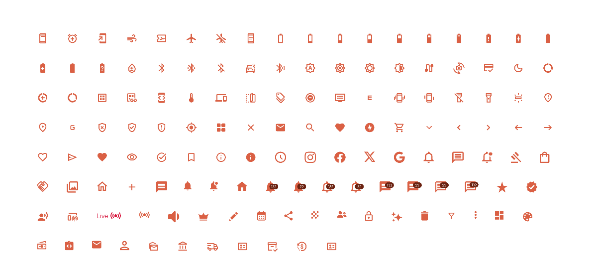
Component Set 2 - Icon Library

Shadow System

A comprehensive shadow system designed for variety of modules and cards to create depth and visual hierarchy.
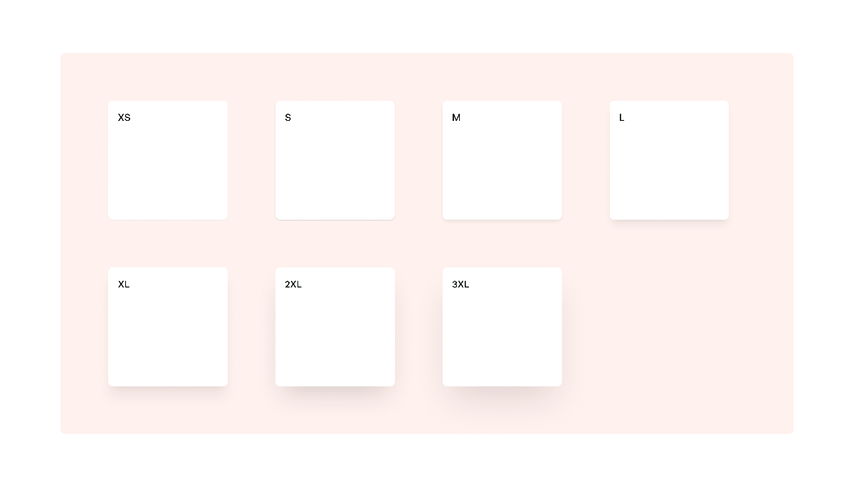
Component Set 3 - Shadow System

Mobile Bottom Navigation

A mobile-optimized bottom navigation system with clear iconography and notification badges for seamless mobile experience.
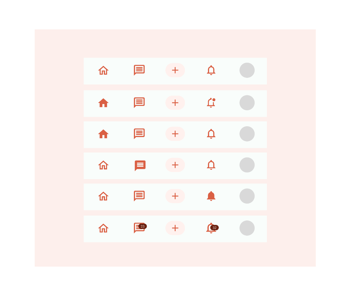
Component Set 4 - Mobile Bottom Navigation

Top Navigation Bar for Desktop

The primary desktop navigation system featuring search, category browsing, user menus, and contextual dropdowns — designed for clarity and efficient wayfinding.
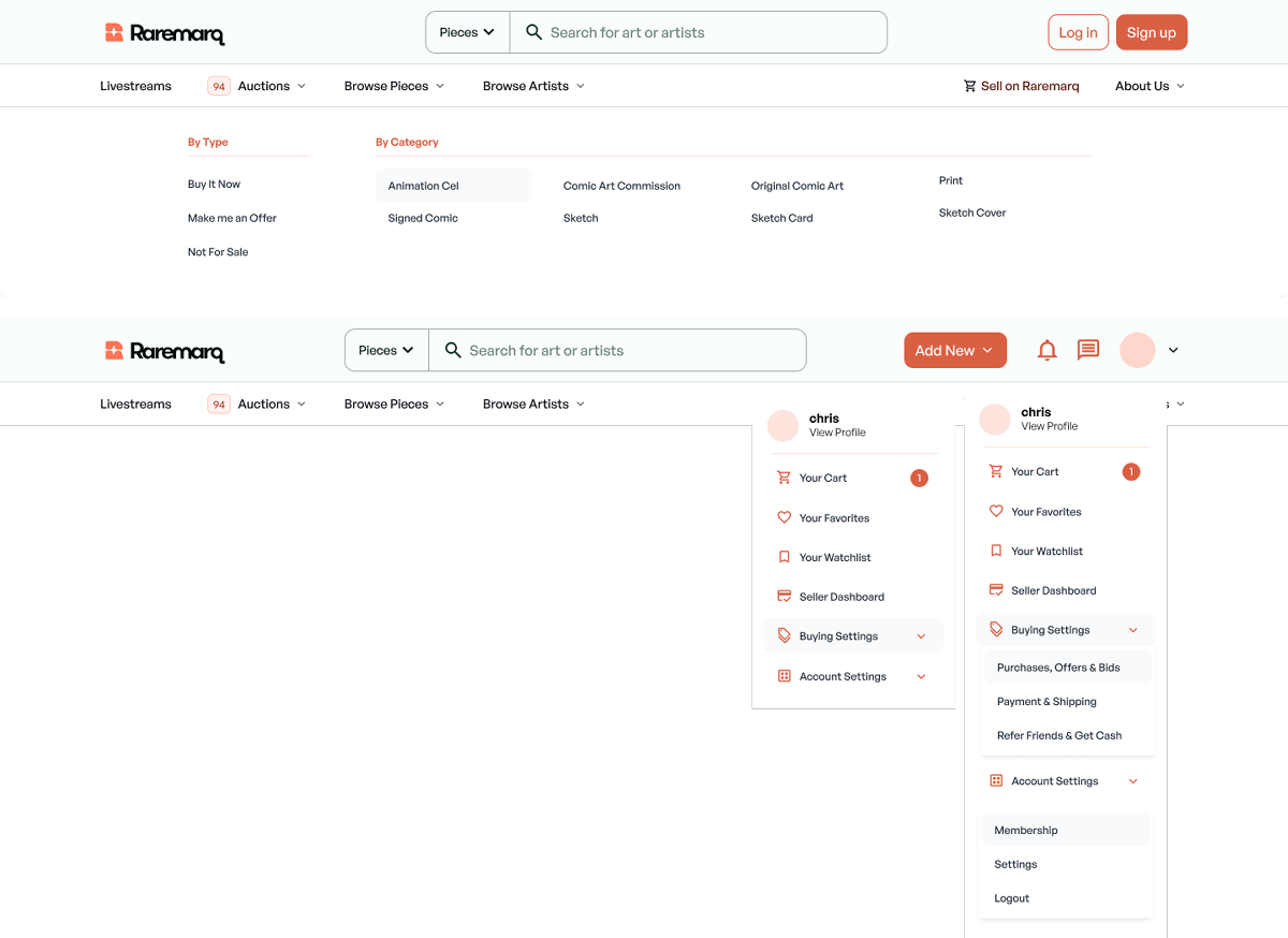
Component Set 5 - Top Navigation Bar for Desktop

Takeaways & Results

The rebrand transformed how users perceived and engaged with Raremarq, directly contributing to significant growth in platform adoption and user trust.

1,000%

Spike in Traffic

301%

YoY Increase in Active Users

45K

Total Users

Key Takeaways

Brand perception directly impacts growth

A cohesive, premium visual identity helped convert investor skepticism into confidence and drove measurable user acquisition.

Collaborative iteration yields stronger outcomes

Working closely with an external studio while providing structured feedback ensured the final direction balanced creativity with strategic goals.

Warmth and premium can coexist

The final palette and typography struck a balance between approachable community vibes and elevated, gallery-worthy aesthetics.

Scalable systems accelerate future work

Building a component library from the start enabled faster feature development and maintained consistency as the product grew.

Let's see what I can build with these components!

Full Web Rebrand — Part 2