Raremarq Web Platform
Raremarq is a social marketplace designed to connect collectors, artists, and sellers in a seamless buying and selling experience. It offers a curated space for discovering original art, rare collectibles, and limited-edition pieces while fostering a community-driven ecosystem.
Unlike traditional e-commerce platforms, Raremarq integrates social engagement, auctions, and live interactions, making it a unique destination for enthusiasts. We aim to provide one of one experiences.
Our goal was to rebrand this community into a space that emphasizes warmth, connection, and a sense of premium belonging.
Old vs New
A comprehensive redesign focused on creating warmth, improving usability, and establishing a cohesive visual identity across the entire platform.
Creating an Account
Before
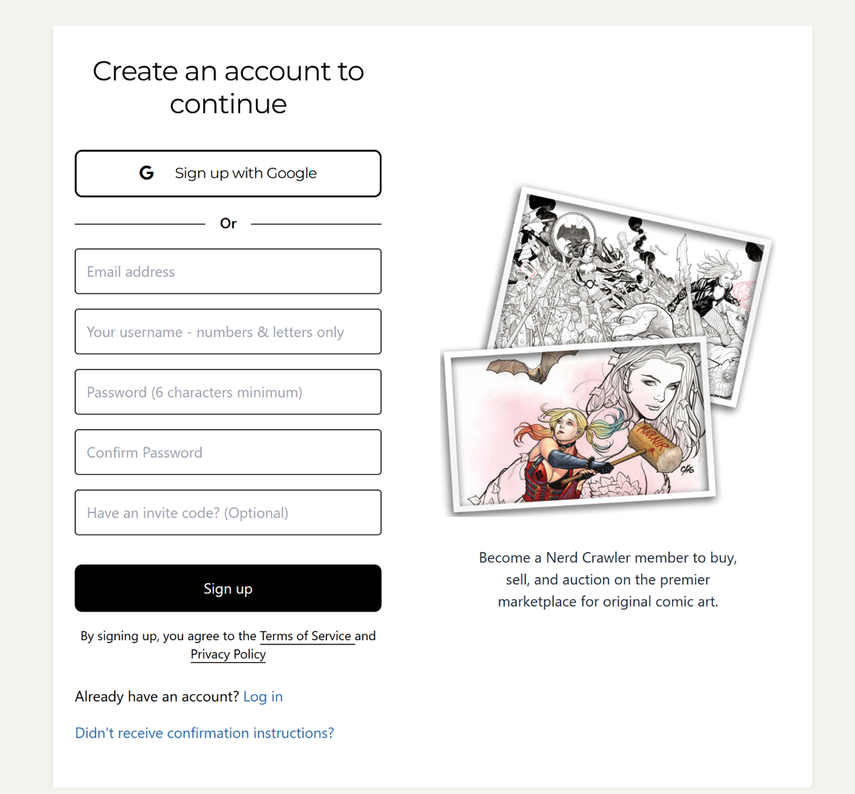
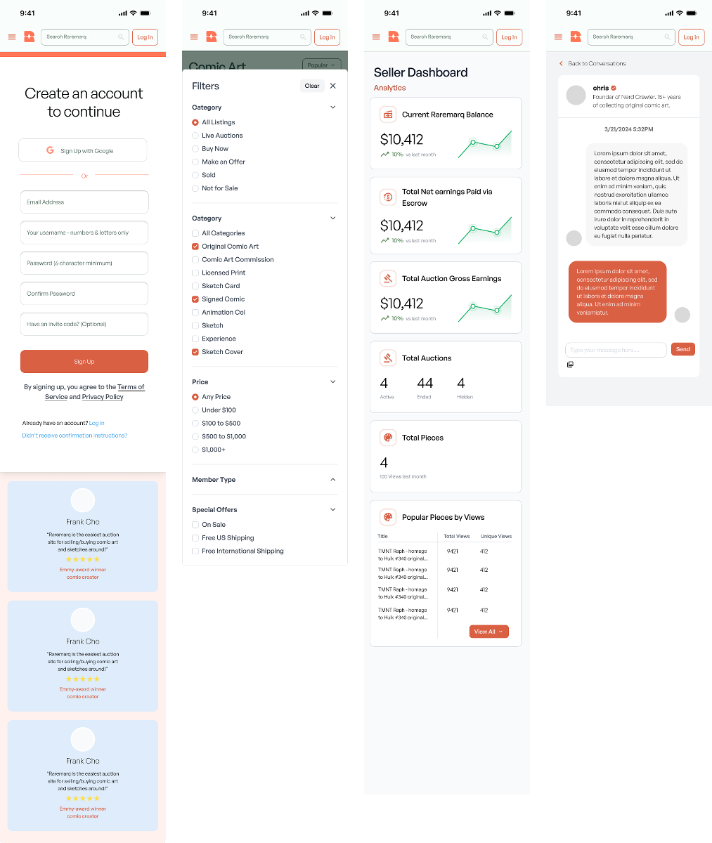
The original sign-up page was functional but lacked emotional connection and social proof. It felt generic and didn't communicate the value of joining the Raremarq community.
After
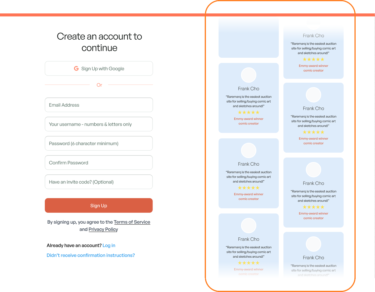
To build trust and increase conversion, I introduced user testimonials directly on the sign-up page. Since Raremarq centers around community and creative expression, showcasing real voices helps validate the platform's value and reduce hesitation for new users. By placing authentic quotes near the sign-up form, users are reminded of the platform's impact — not from us, but from artists and fans like them. This social proof reinforces credibility and creates an emotional connection at a critical decision point, ultimately driving sign-ups.
Log In
Before
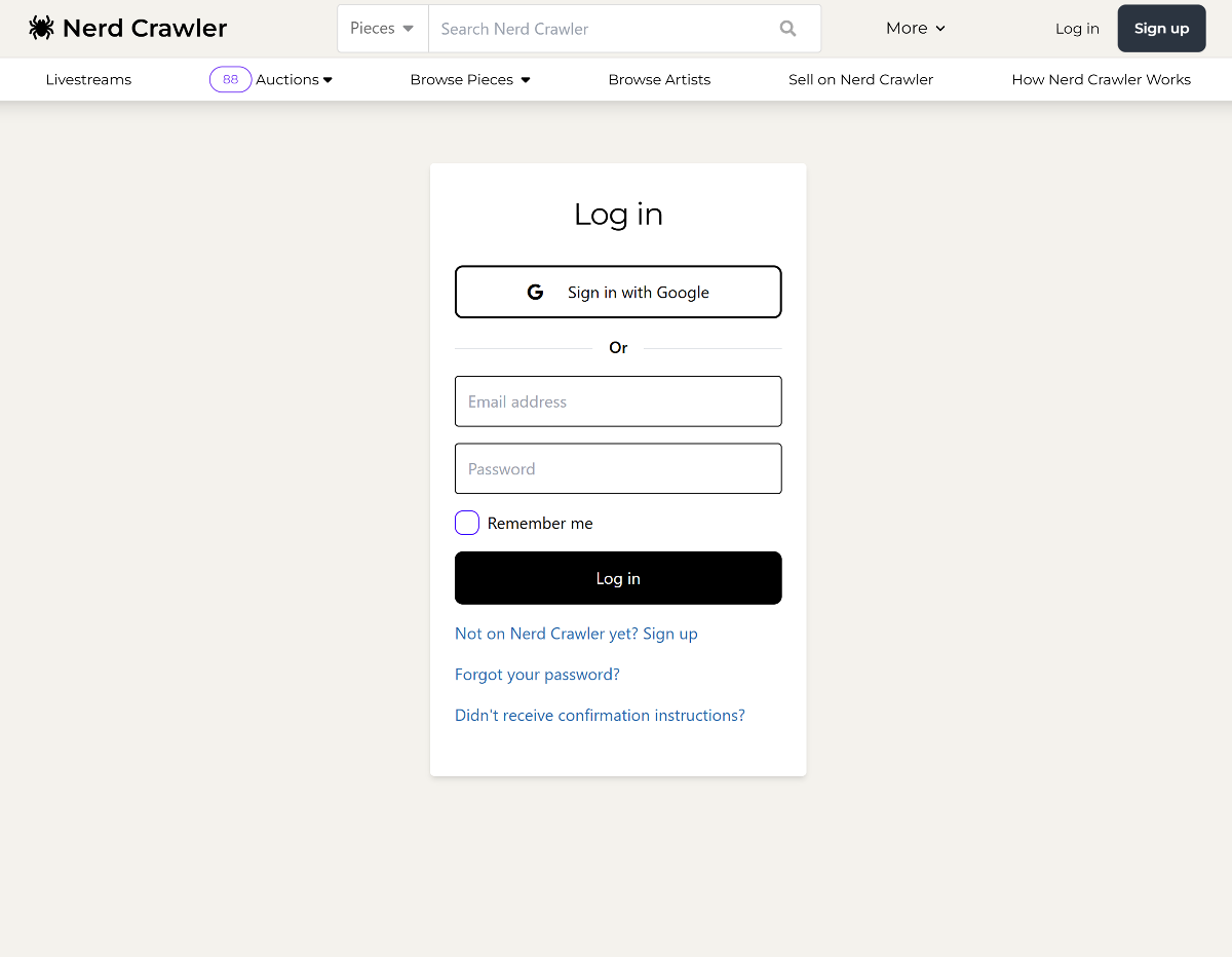
The original login page felt generic and lacked emotional resonance. It used minimal color, harsh black CTAs, and had no clear connection to the brand's identity or values.
After
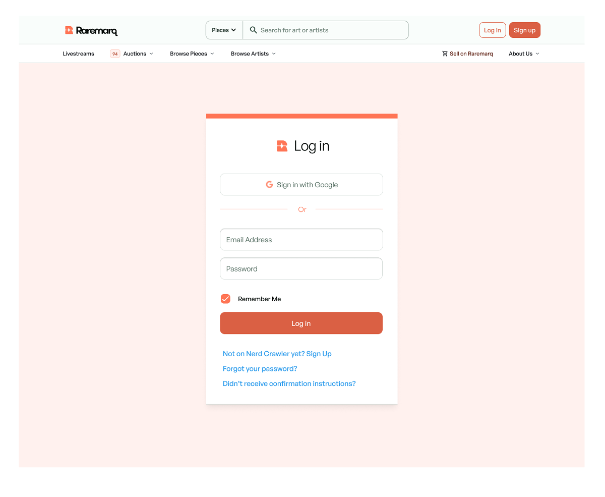
I redesigned the page with Raremarq's warm, premium aesthetic — using a soft pink background, branded iconography, and rounded UI elements. The updated form improves readability and user trust while aligning with the full design system. This redesign transformed a sterile entry point into a welcoming, brand-aligned experience — reinforcing user confidence and improving consistency across the product.
Auction Page
Before
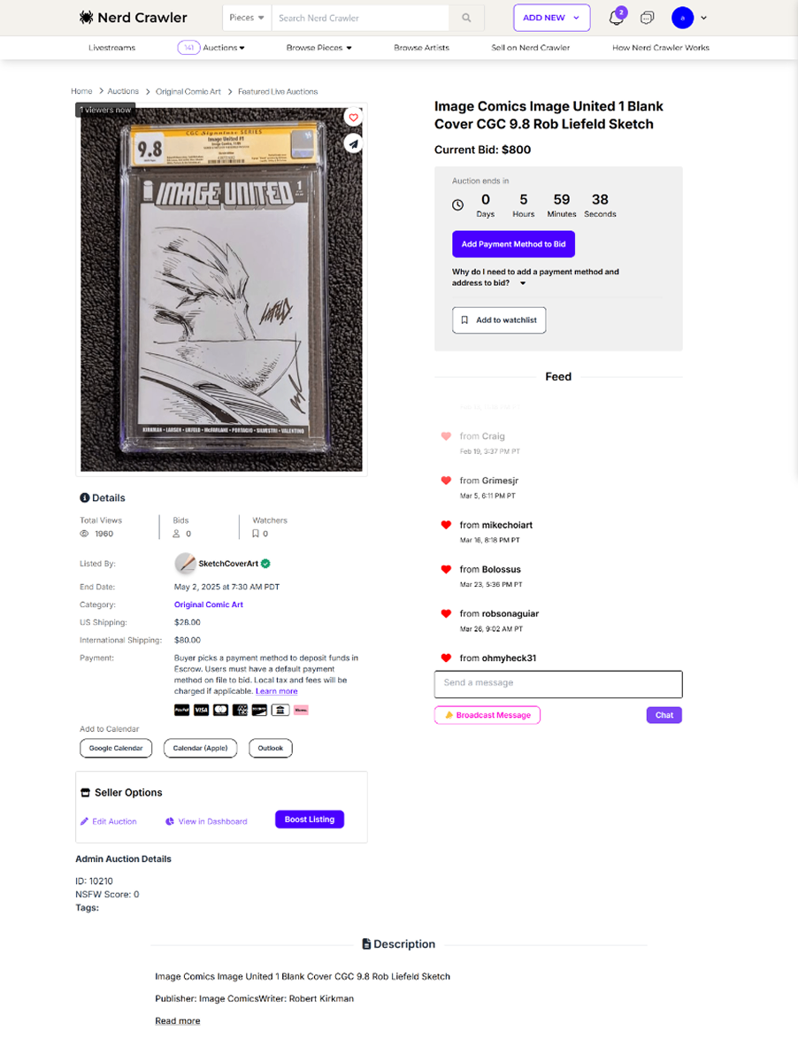
No clear discovery mechanism existed. Related items were either missing or visually inconsistent, making it difficult for users to explore beyond a single auction.
After
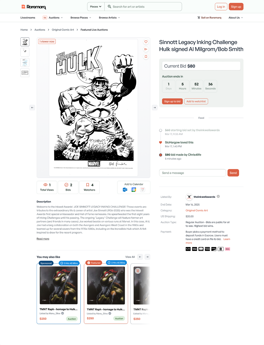
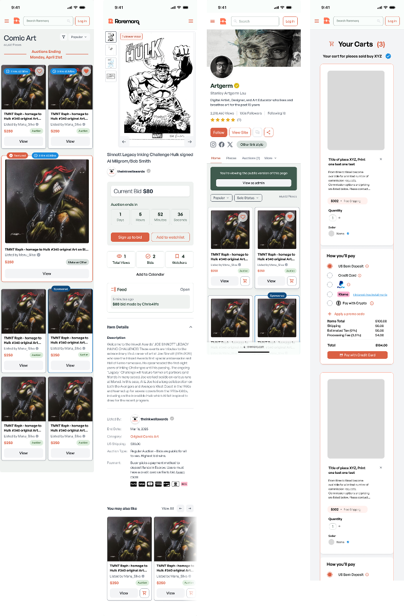
I introduced a modular, scrollable 'You May Also Like' section that dynamically surfaces related pieces. Users can browse horizontally through recommended items, each clearly labeled with auction status (e.g., 'Live,' 'Featured,' 'Sponsored') and pricing details. This module was designed to: encourage deeper browsing and increase time-on-site, support scalability adapting to different listing types (fixed price, live auction, etc.), and strengthen visual cohesion through consistent card design and color-coded badges. By integrating this scrollable recommendation module, I transformed a static auction page into a more engaging, exploratory experience — helping users discover more and increasing platform stickiness.
Auction Listings
Before
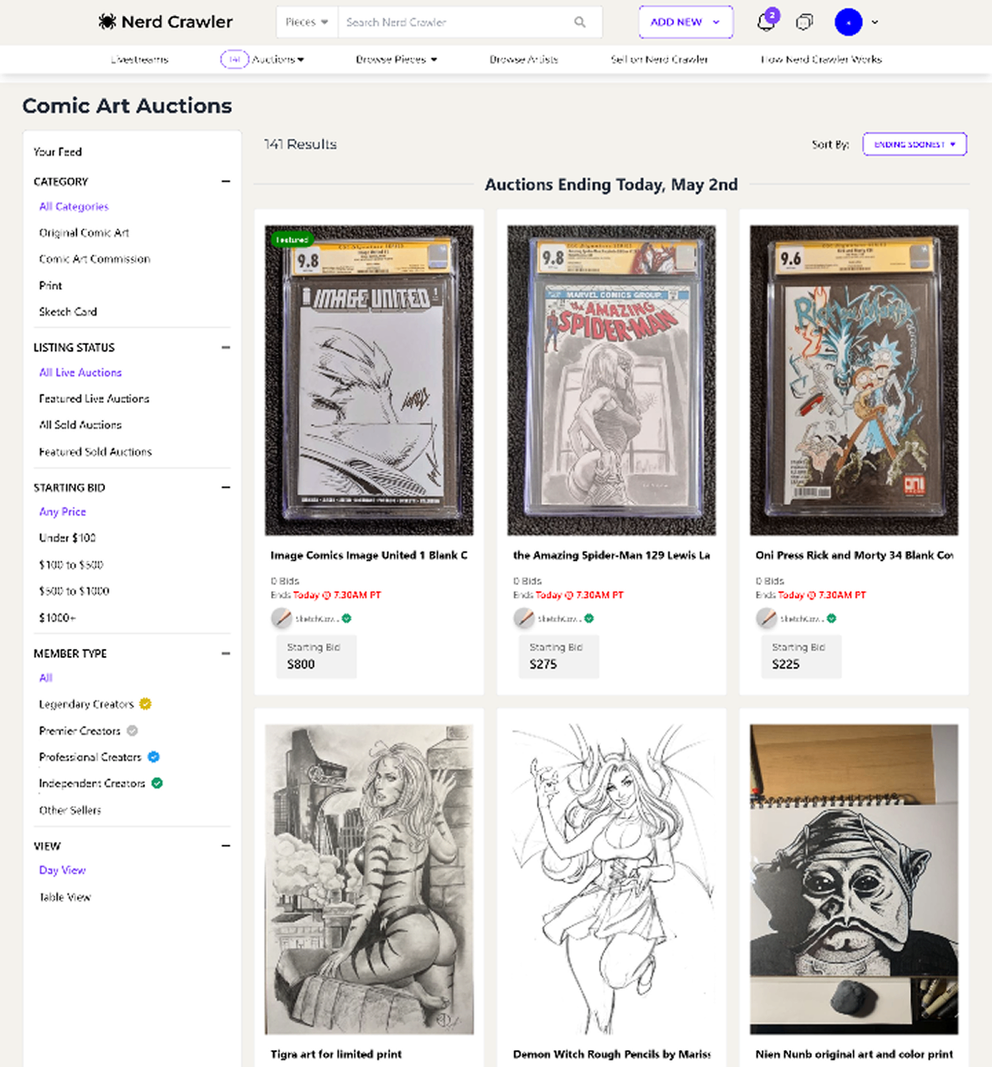
The original layout was text-heavy and difficult to scan. Listing filters were cluttered and the visual hierarchy made it hard for users to quickly compare auctions or understand urgency.
After
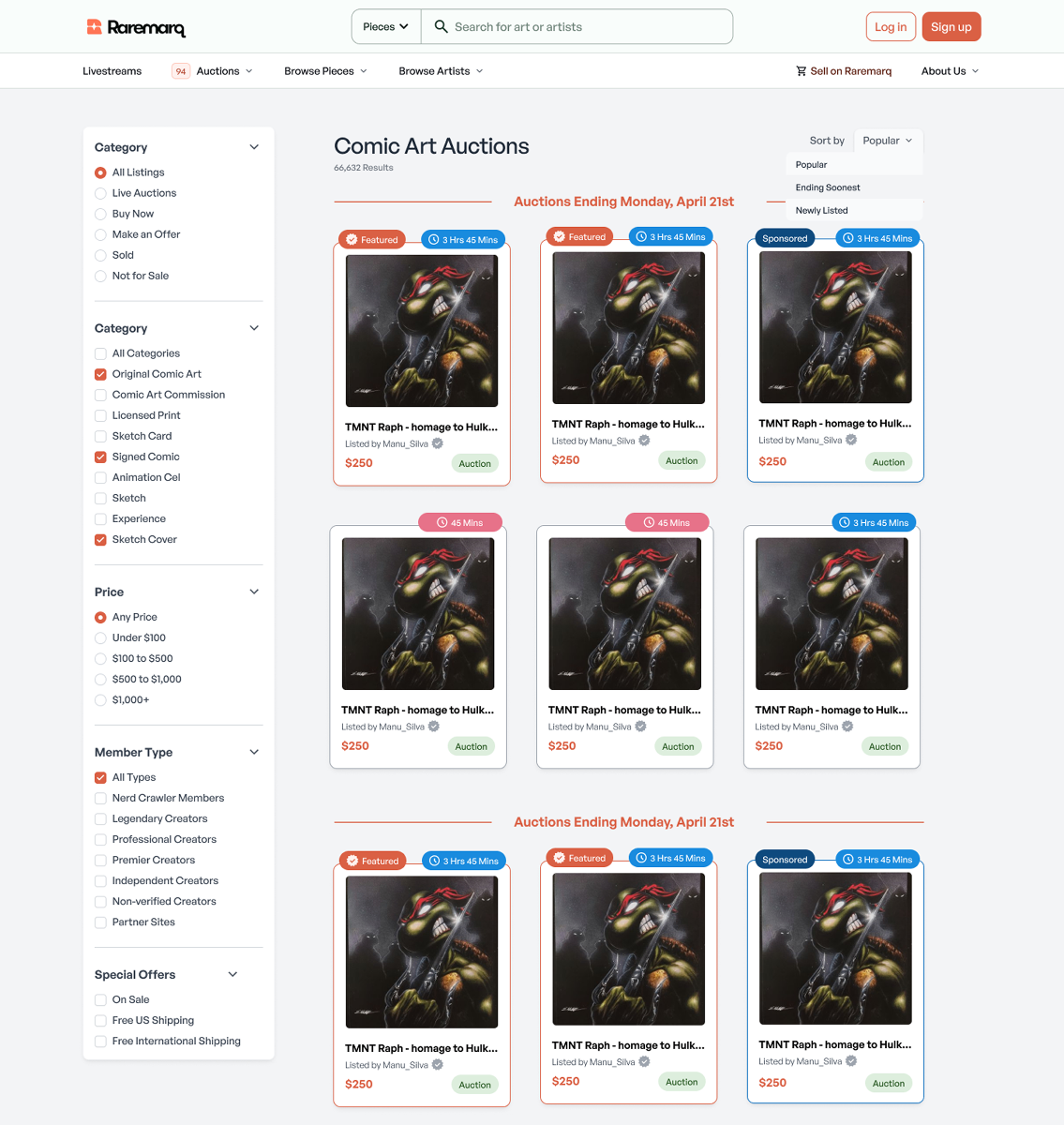
I redesigned the page into a more grid-based, scannable layout that prioritizes discoverability and auction clarity. Listings now feature: visual urgency cues (e.g., countdown timers, 'Featured' and 'Sponsored' badges), consistent card design that scales across devices, and cleaner filter UI for easier narrowing of results. This redesign improves user flow (cards are easier to compare at a glance), engagement (clearer CTAs and urgency increase likelihood of bids), and scalability (badge system supports future auction types). By reorganizing listings into structured, labeled components, I helped users navigate auctions faster while giving sellers more visibility through badge tiers and visual prioritization.
User Profile Page
Before
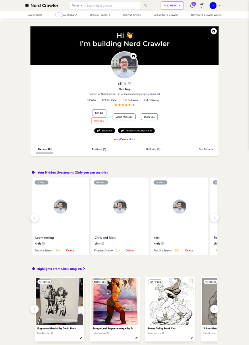
The original profile page was cluttered with exposed actions like 'Edit,' 'Delete,' and 'Practice Stream' directly on every content card. This overwhelmed the interface — especially for creators with a large volume of livestreams or artworks. There was no distinction between what creators saw vs. what visitors saw.
After
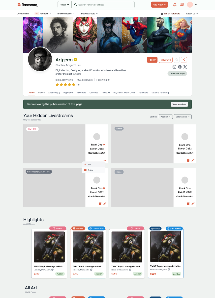
I redesigned the profile page to feel more curated, structured, and scalable. Key updates include: Introduced a 'Viewing the public version of this page' banner to clearly separate creator and visitor views, improving UX clarity and reducing confusion. Finalized a three-dot overflow menu on each content card to group secondary actions (Edit/Delete), reducing visual noise while preserving full functionality. Streamlined sections like Highlights, All Art, and Hidden Livestreams to improve browsing and modular consistency. The profile redesign focused on decluttering high-density user flows and introducing scalable UI patterns. The public/private view toggle and three-dot overflow were key decisions that balanced control, clarity, and aesthetics.
Conversations/Messaging
Before
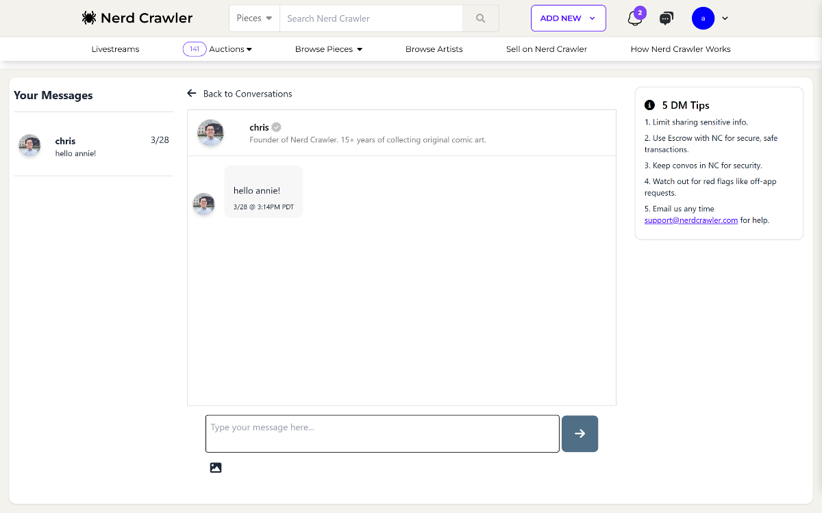
The original messaging layout was overly basic and difficult to scale. Messages lacked visual hierarchy, the user panel was cramped, and everything shared the same visual weight. DM tips were informative but visually disconnected.
After
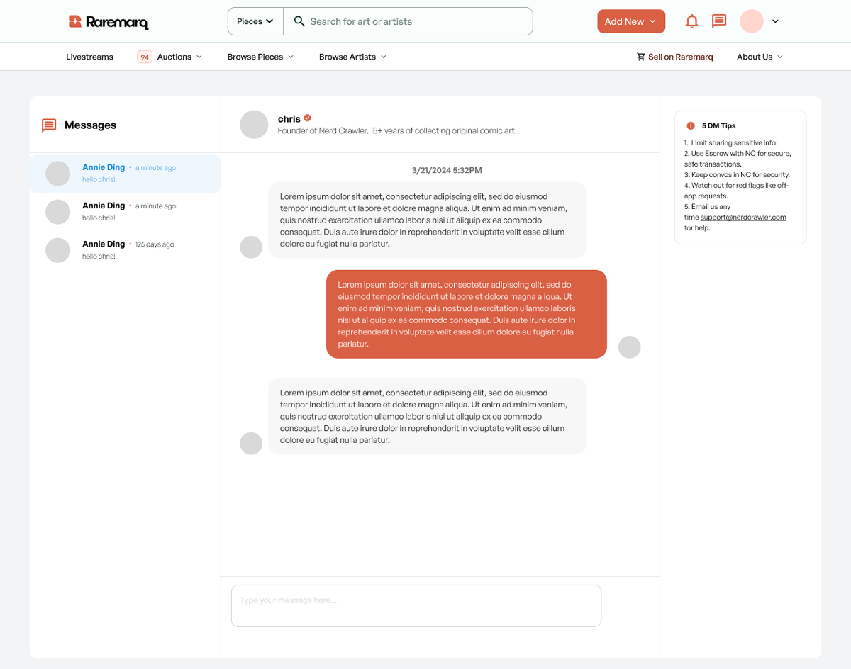
I redesigned the conversation system to feel more modern, legible, and scalable. Key improvements include: Structured sidebar with cleaner sender preview and timestamps. Differentiated message styling, including sender-specific bubble colors to improve readability in long threads. Refined layout of DM tips, integrated cleanly with the design system. Improved spacing and padding to enhance readability and focus. This redesign created a clearer, more intuitive messaging experience — one that supports high-volume conversations while feeling secure, clean, and brand-consistent.
Your Cart
Before
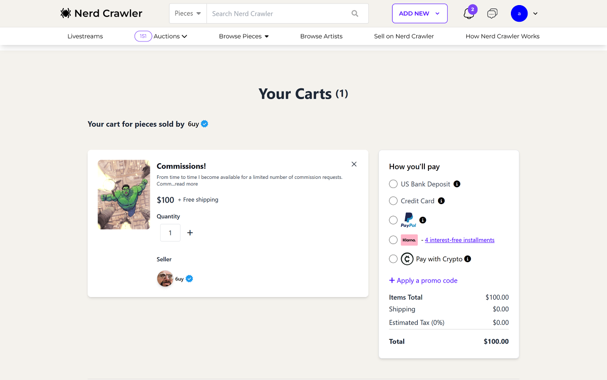
The original cart page lacked hierarchy and polish. Key information like pricing, seller details, and payment options were cluttered or visually inconsistent. The payment column lacked emphasis on next steps, and there was no visual reinforcement of trust or urgency.
After
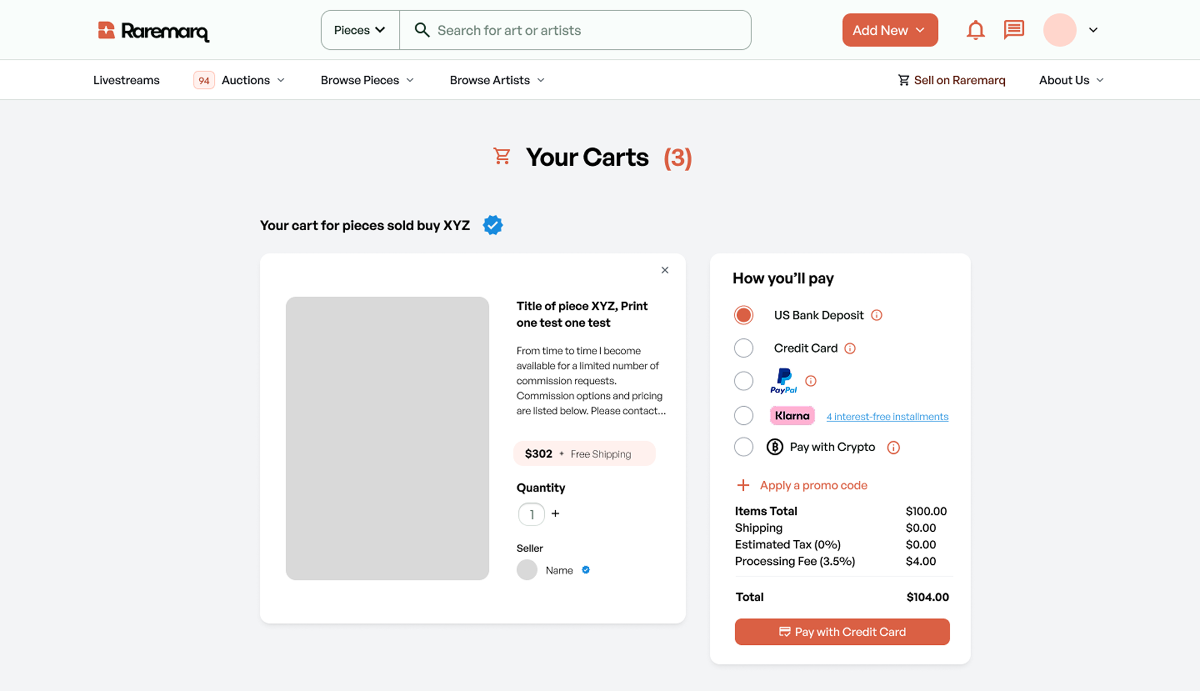
I redesigned the cart to feel more structured, trustworthy, and ready for conversion. Key improvements include: Clear payment section with better grouping and visual spacing. Consistent, modular item cards with thumbnail, description, seller info, and shipping badges. More prominent CTA ('Pay with Credit Card') to guide users forward. Support for multiple cart items from different sellers, displayed cleanly. The redesigned cart improves clarity at checkout, boosts user trust with cleaner seller display, and introduces scalable payment UX for growing order volume.
Seller Dashboard
Before
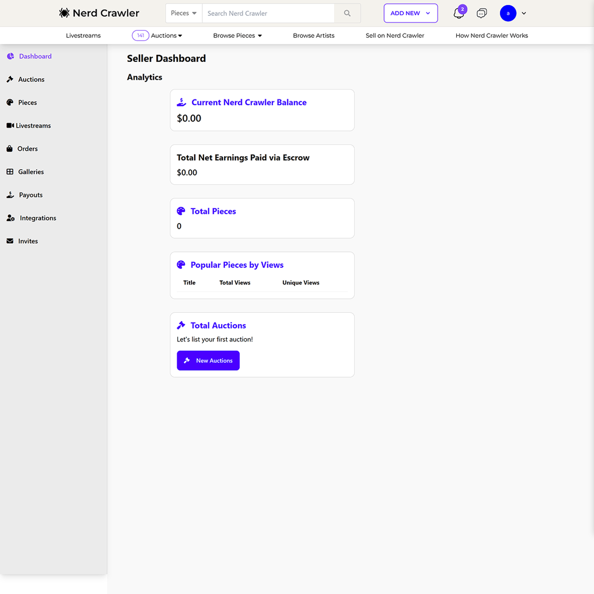
The original dashboard was sparse and underpowered — it displayed key metrics (like balance and views) as plain text blocks with minimal hierarchy, no visual indicators, and limited data insights.
After
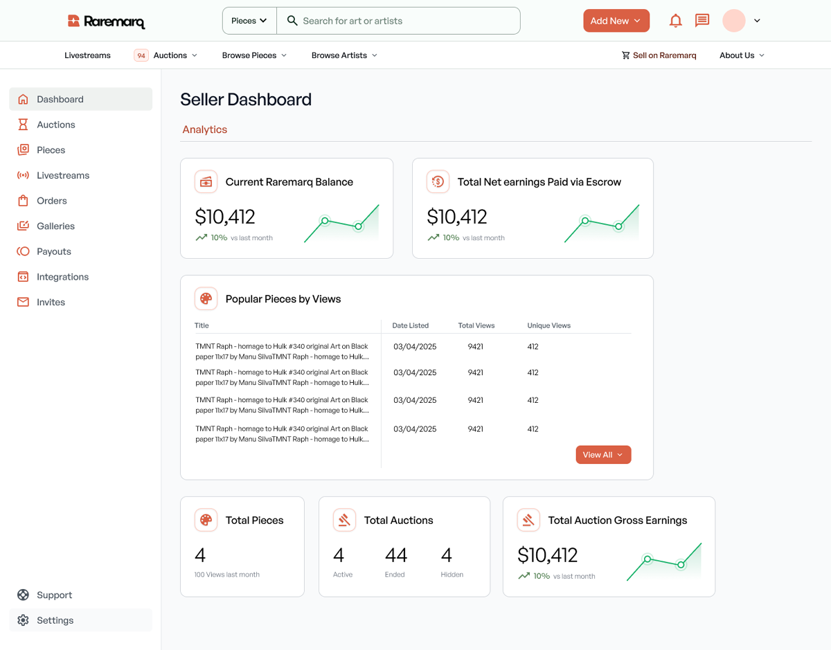
I redesigned the dashboard to feel data-rich, visually digestible, and scalable for growth-focused creators. Key upgrades include: Data visualization for balance and escrow earnings, with growth indicators and historical trends. Structured tables and cards for performance metrics like popular pieces, total views, and auction history. Improved content density without sacrificing readability, making it easy to scan at a glance. This redesign helps sellers better track earnings, performance, and content traction — making business insights actionable with a clear, visual-first interface.
Main Home Page Redesign
Before
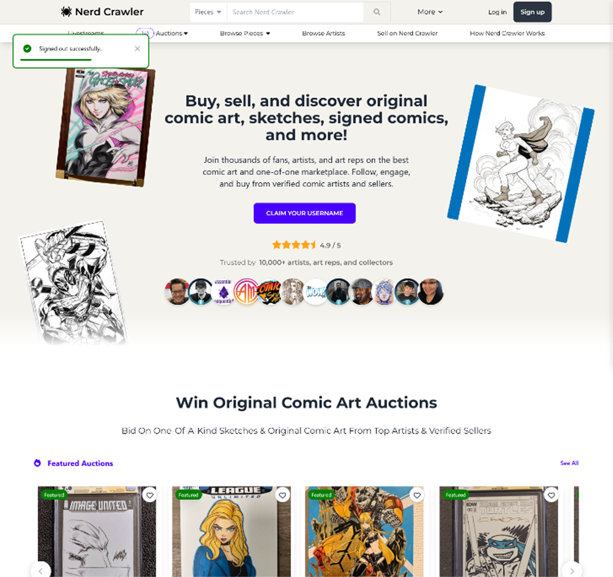
After
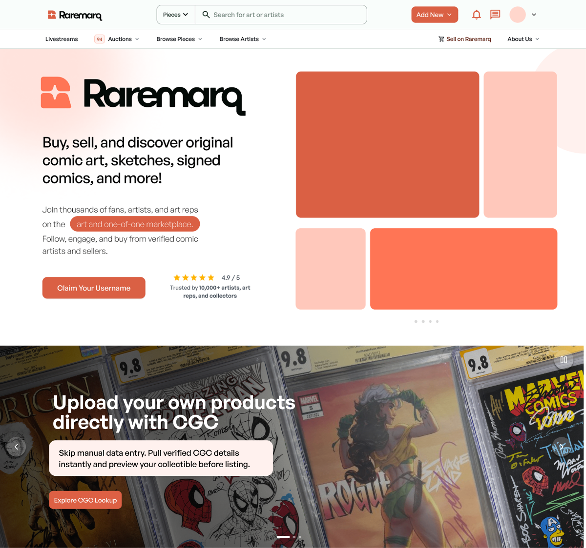
Mobile Optimizations
The original platform lacked fully optimized mobile screens — many layouts broke on smaller devices, with misaligned components, poor tap targets, and missing responsive behavior. This made it difficult for users to browse, bid, or manage content on the go.
I led the effort to redesign key screens with a mobile-first mindset. Every page was restructured to ensure responsive behavior, clean hierarchy, and seamless interaction across devices. Core actions like bidding, messaging, and managing livestreams are now easily accessible on mobile without compromising brand experience.
This redesign significantly improved mobile usability and accessibility — allowing users to interact with the platform confidently from any device.
Takeaways & Results
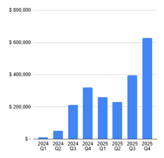
The web platform redesign transformed how users engaged with Raremarq, directly contributing to significant growth in marketplace activity and user trust.
